Industrial Product Design.
-
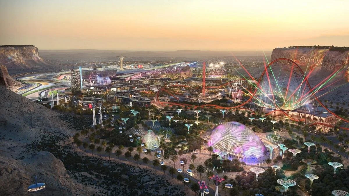
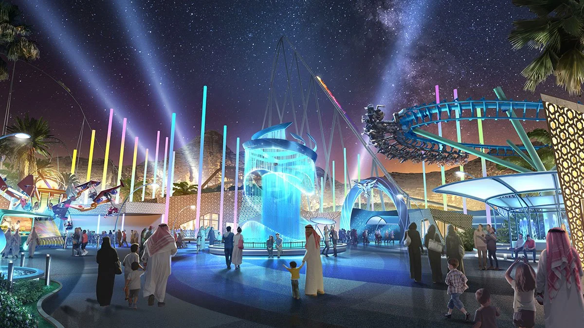
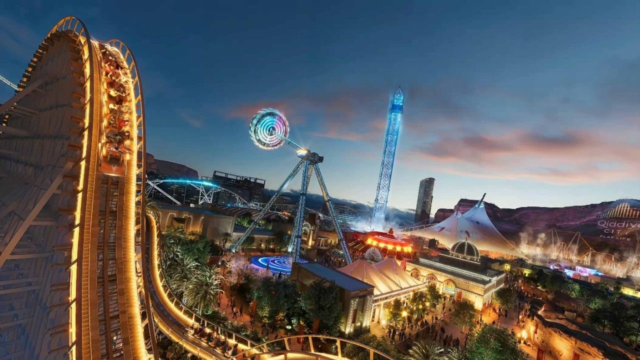
Qiddiya Six Flags isn't just a theme park, it's a destination. The challenge was to design a signage and wayfinding system that could match the scale and ambition of one of the most anticipated entertainment destinations in the world.
-
The concept started with Qiddiya's core brand idea ‘play’ and asked how far it could stretch. The answer was a digital universe. A self-contained world with its own identity, its own visual language, and its own rules. Not a park with signs, but a city that speaks.
Every directional element, every zone marker, every touchpoint was designed to feel like it belonged to this universe natively, as if the world had always existed and the signs had grown out of it organically.
-
The narrative came first. Before a single sign was designed, the universe was defined, its tone, its visual language, its rules. The wayfinding system grew out of that world, not the other way around. Every element had to feel native to the space, as if it had always existed there.
-
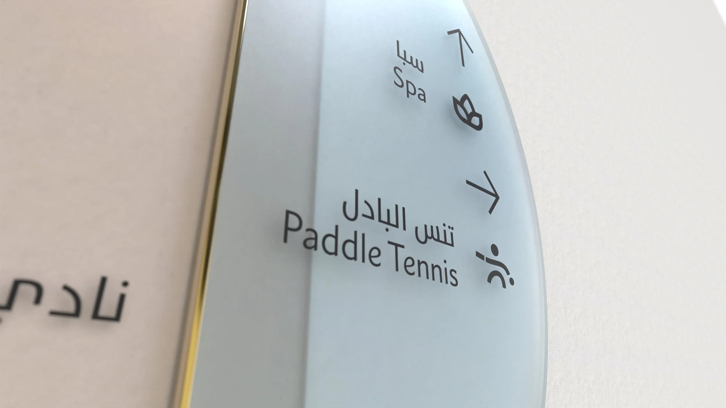
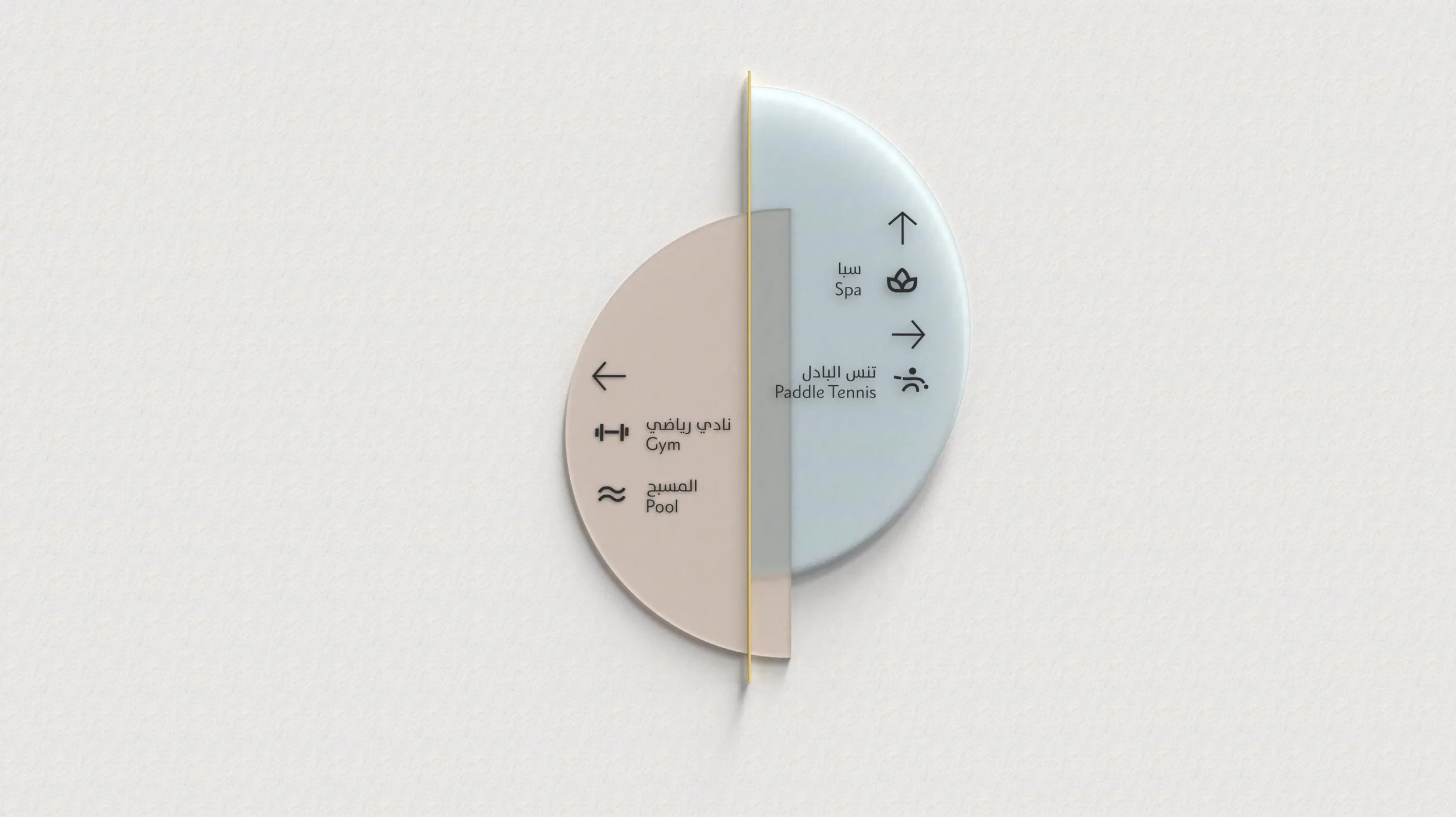
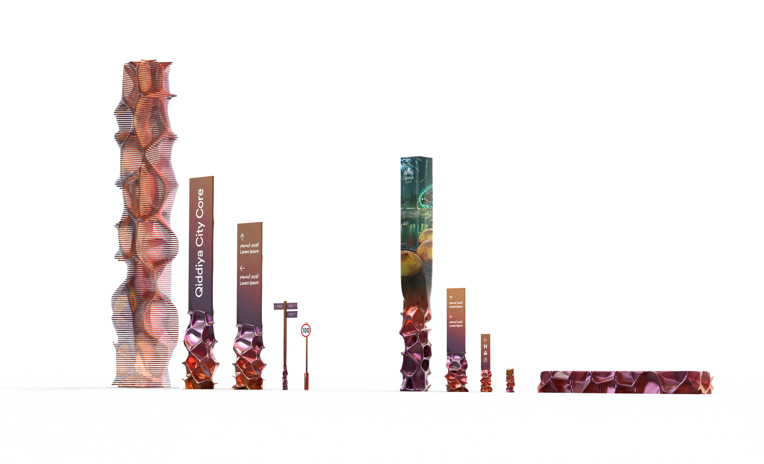
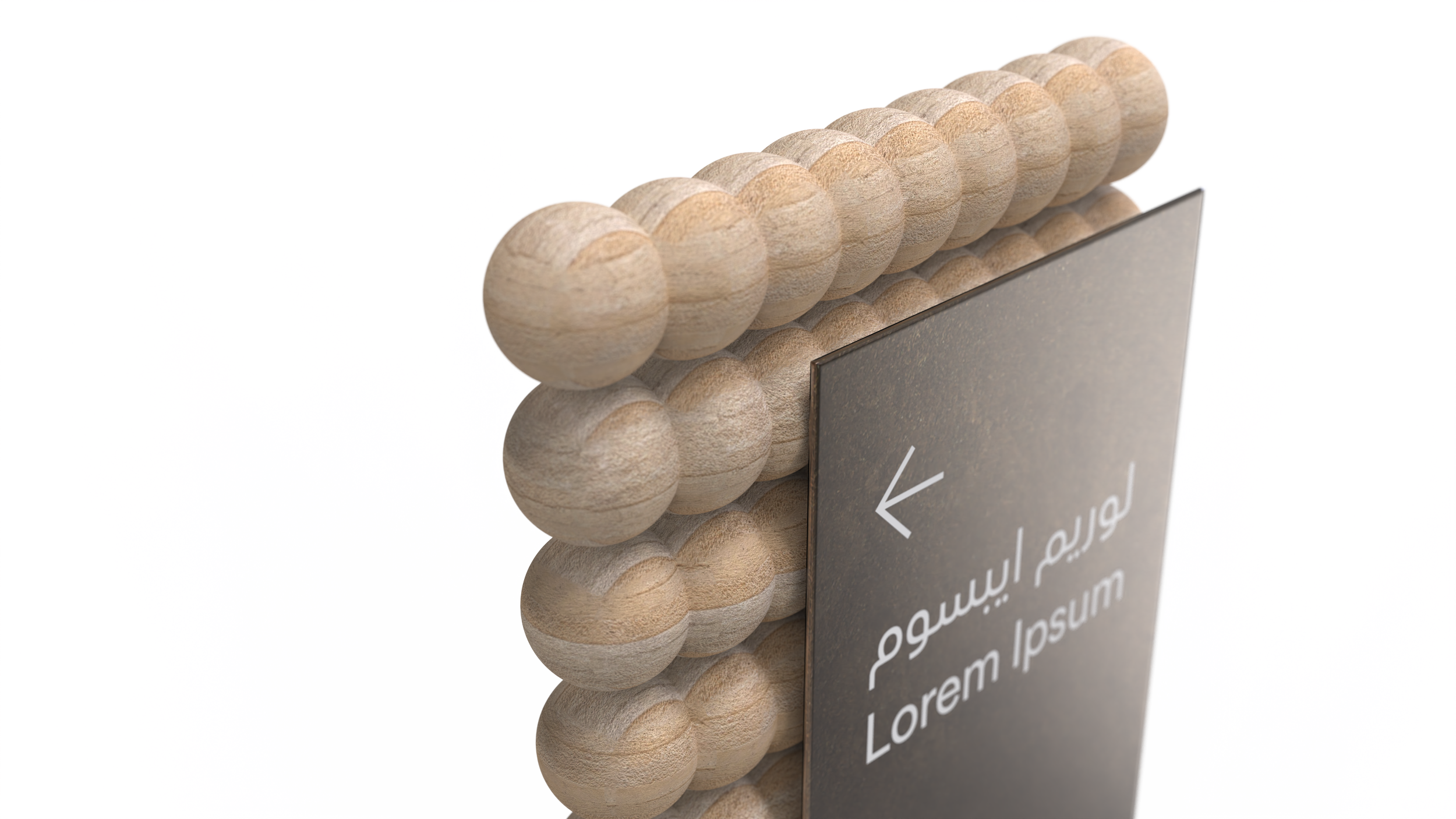
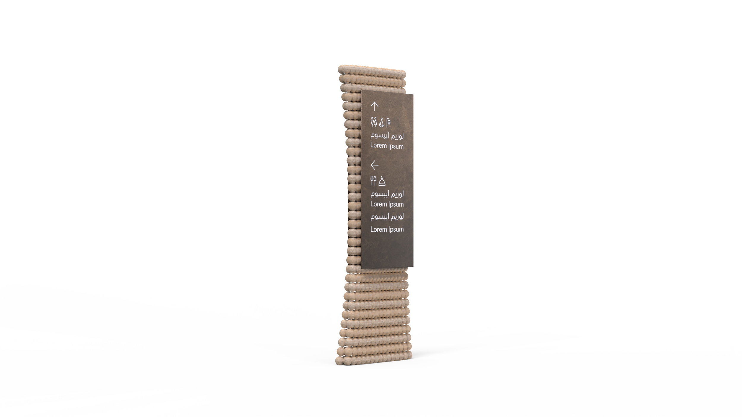
From zone identities to directional hierarchies, the system was designed to guide millions of visitors through an immersive environment without ever breaking the illusion. The signage doesn't just point, it tells a story.
01.
Qiddiya Six Flags Theme Park Competition.


The Narrative.
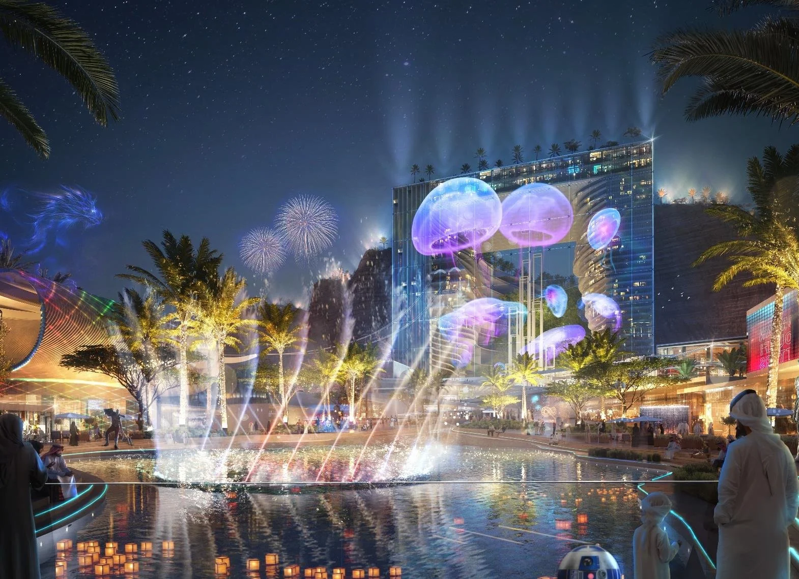
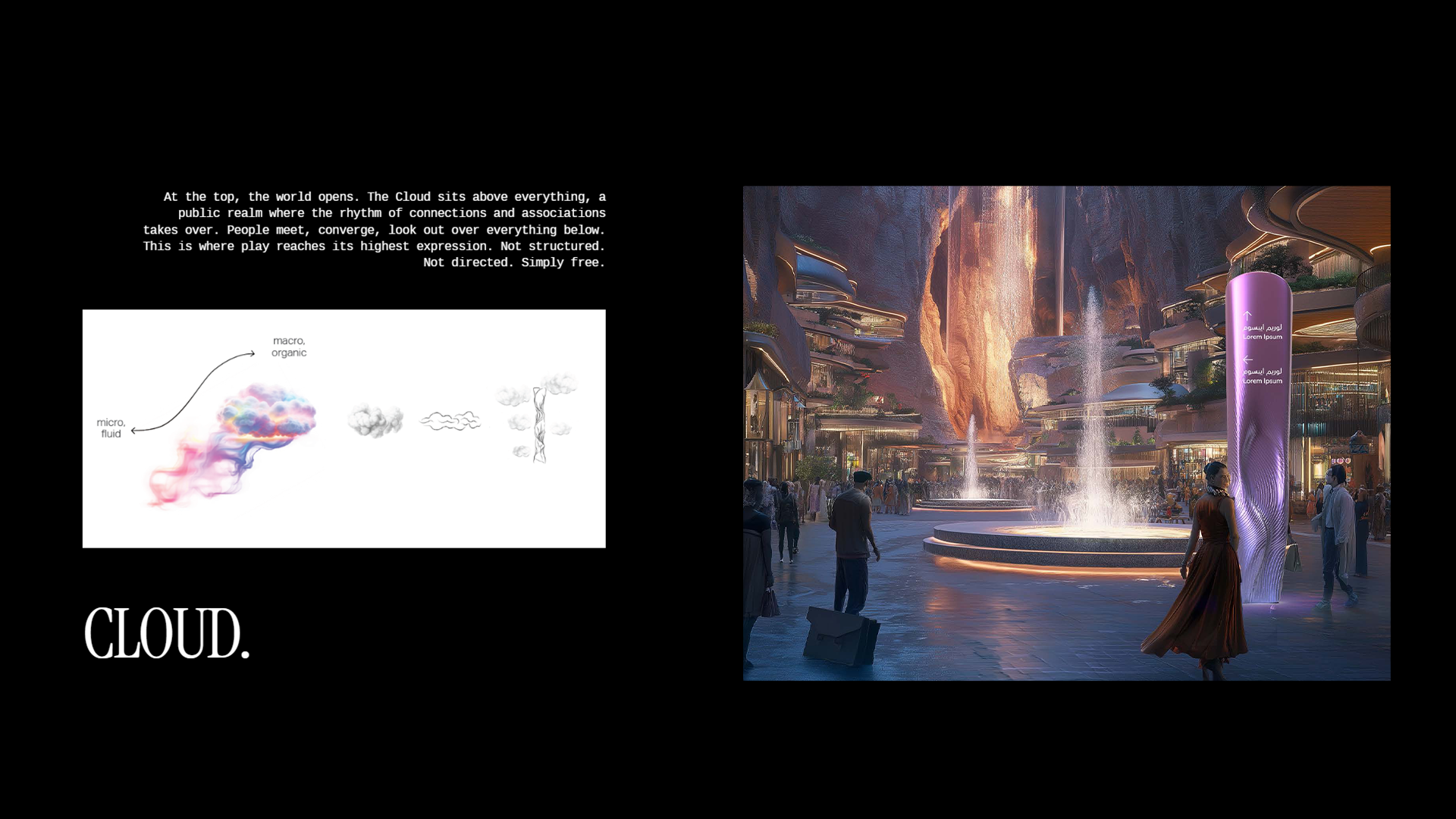
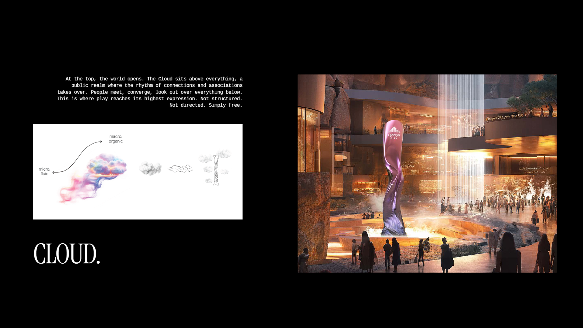
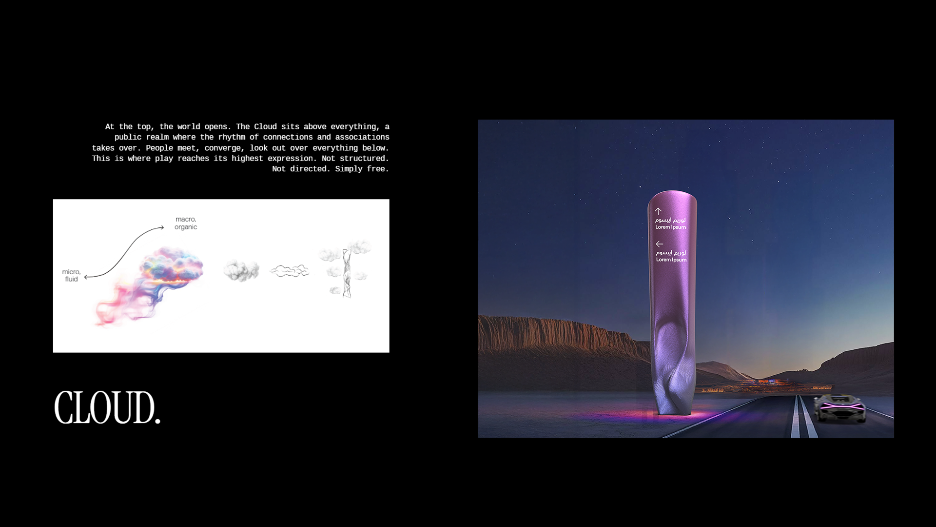
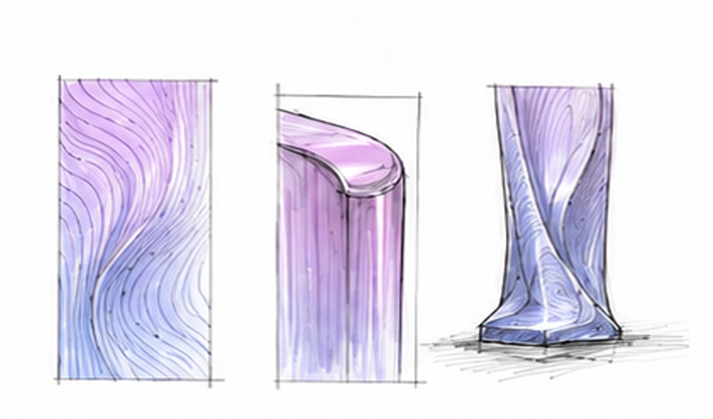
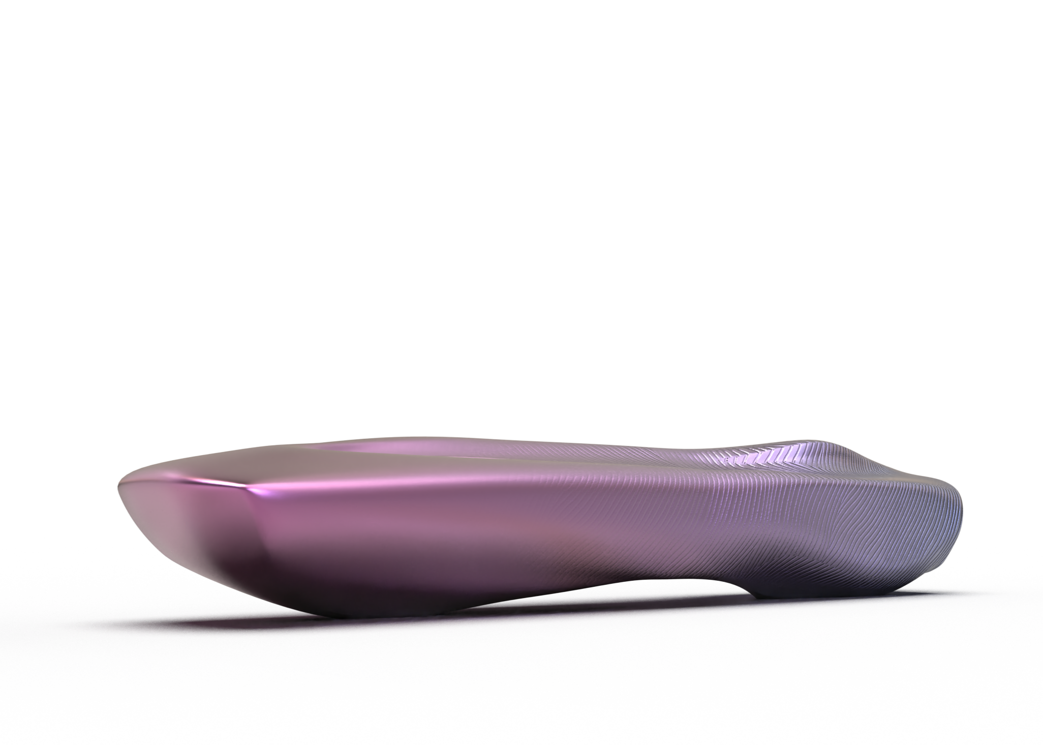
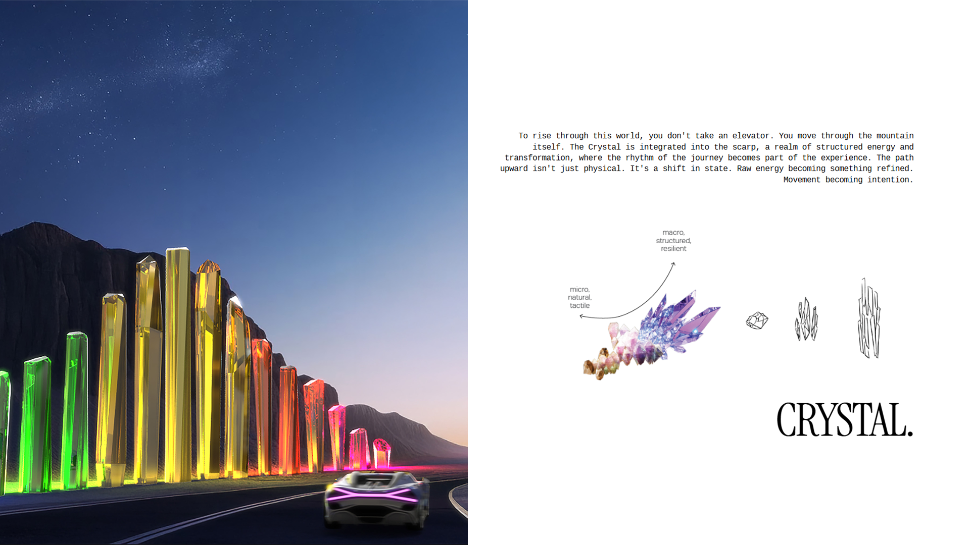
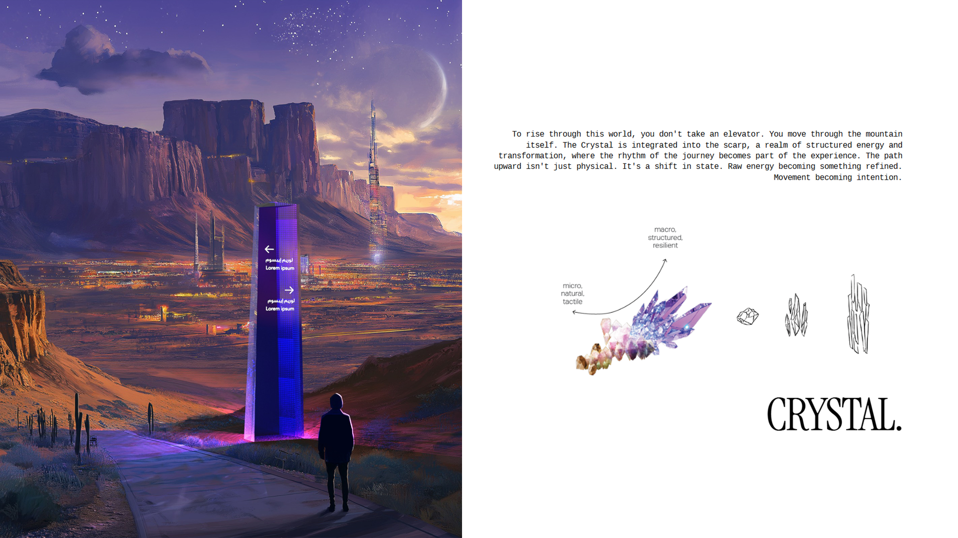
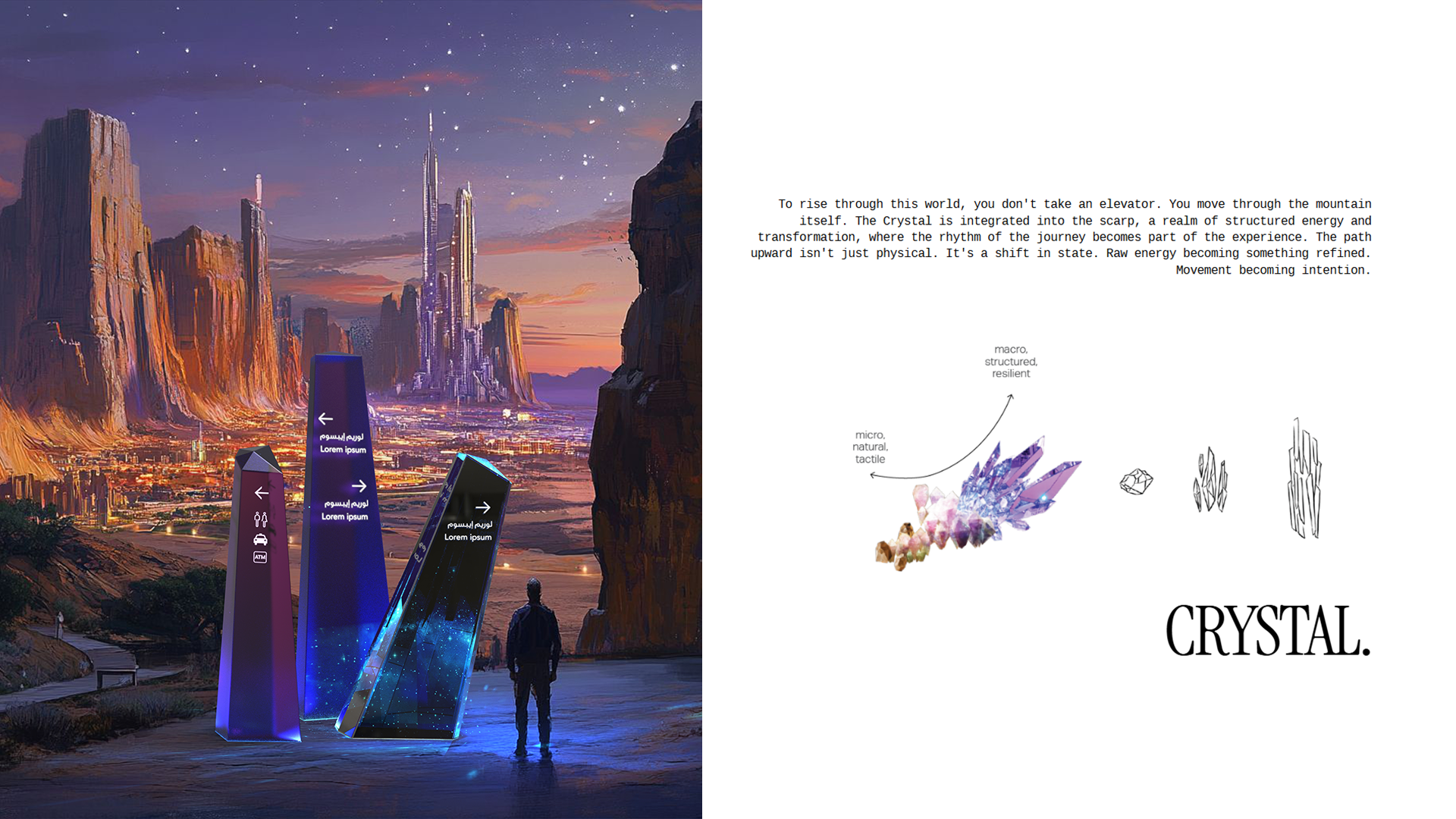
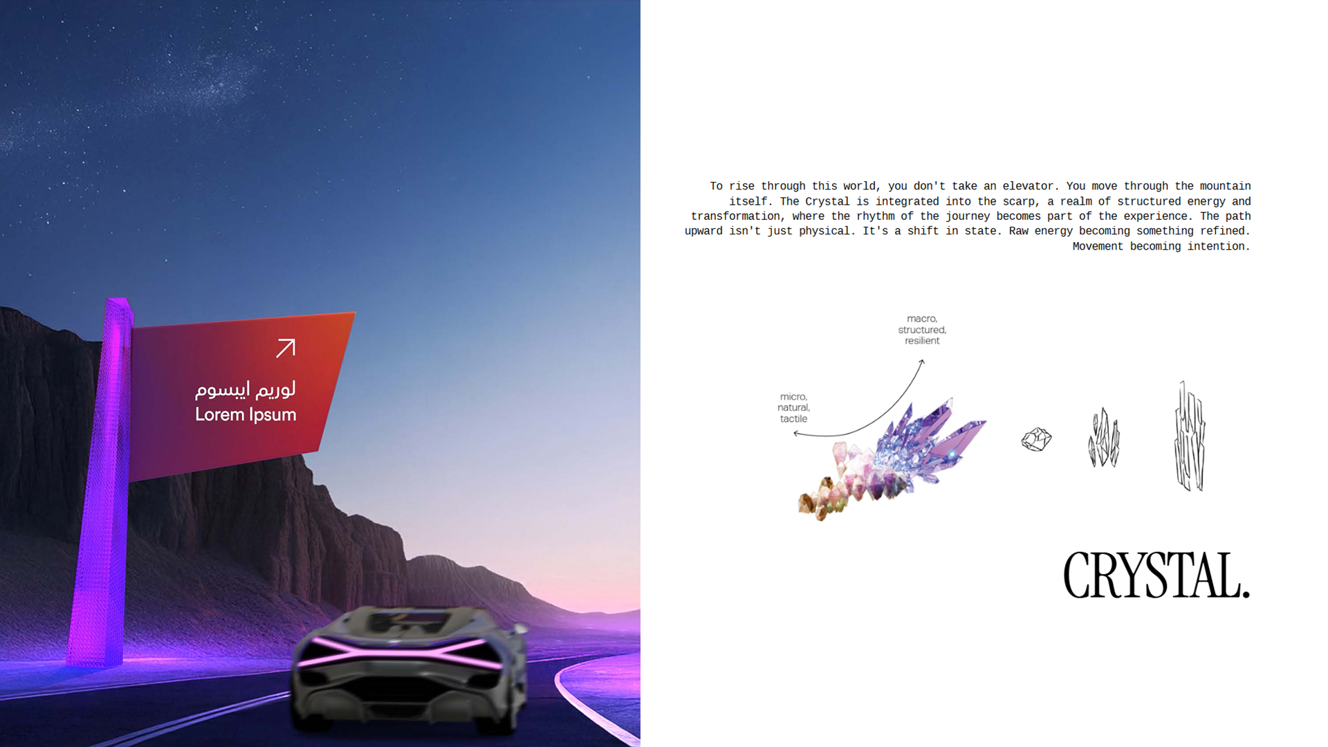
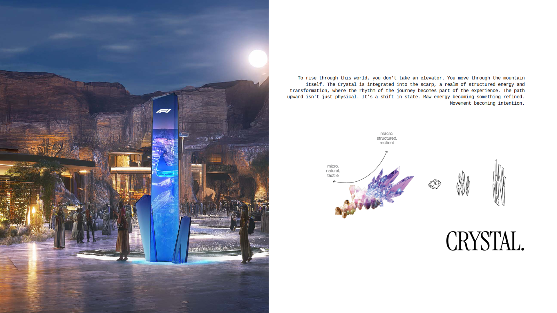
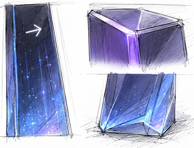
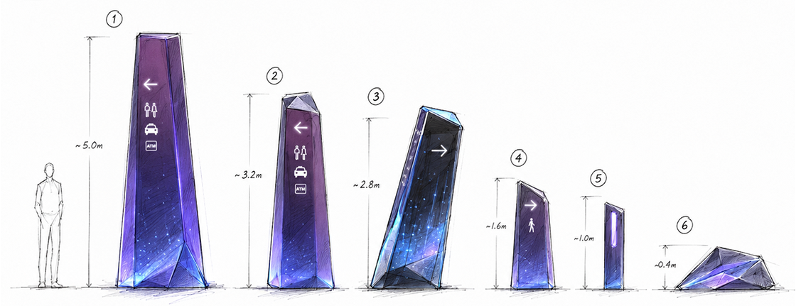
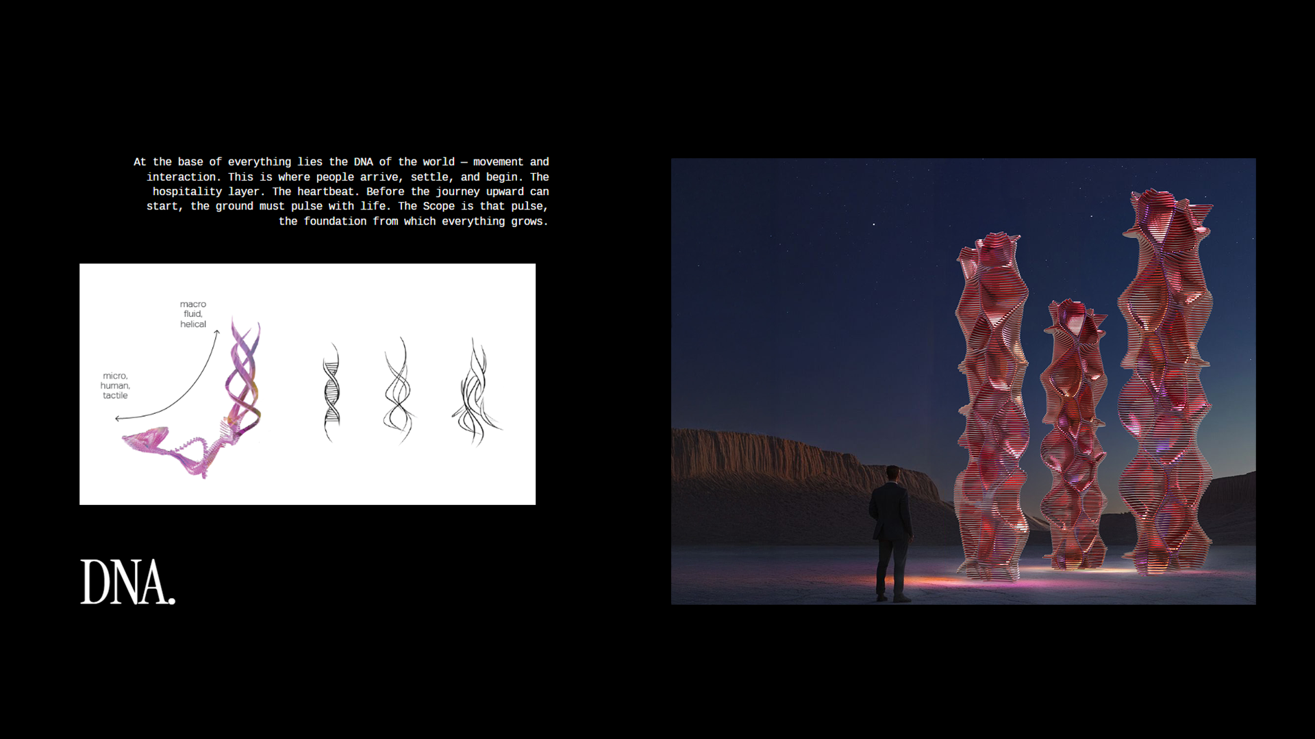
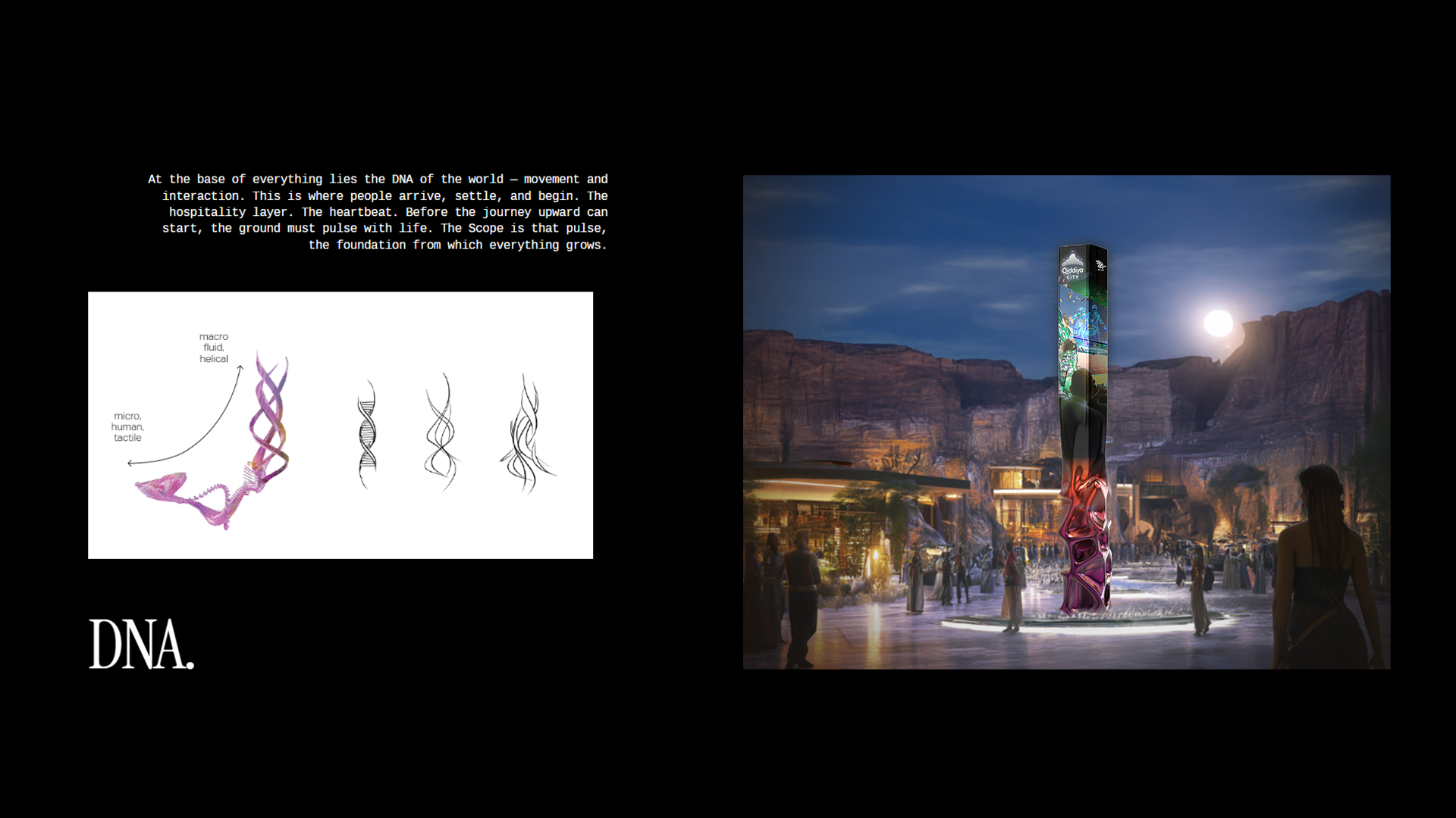
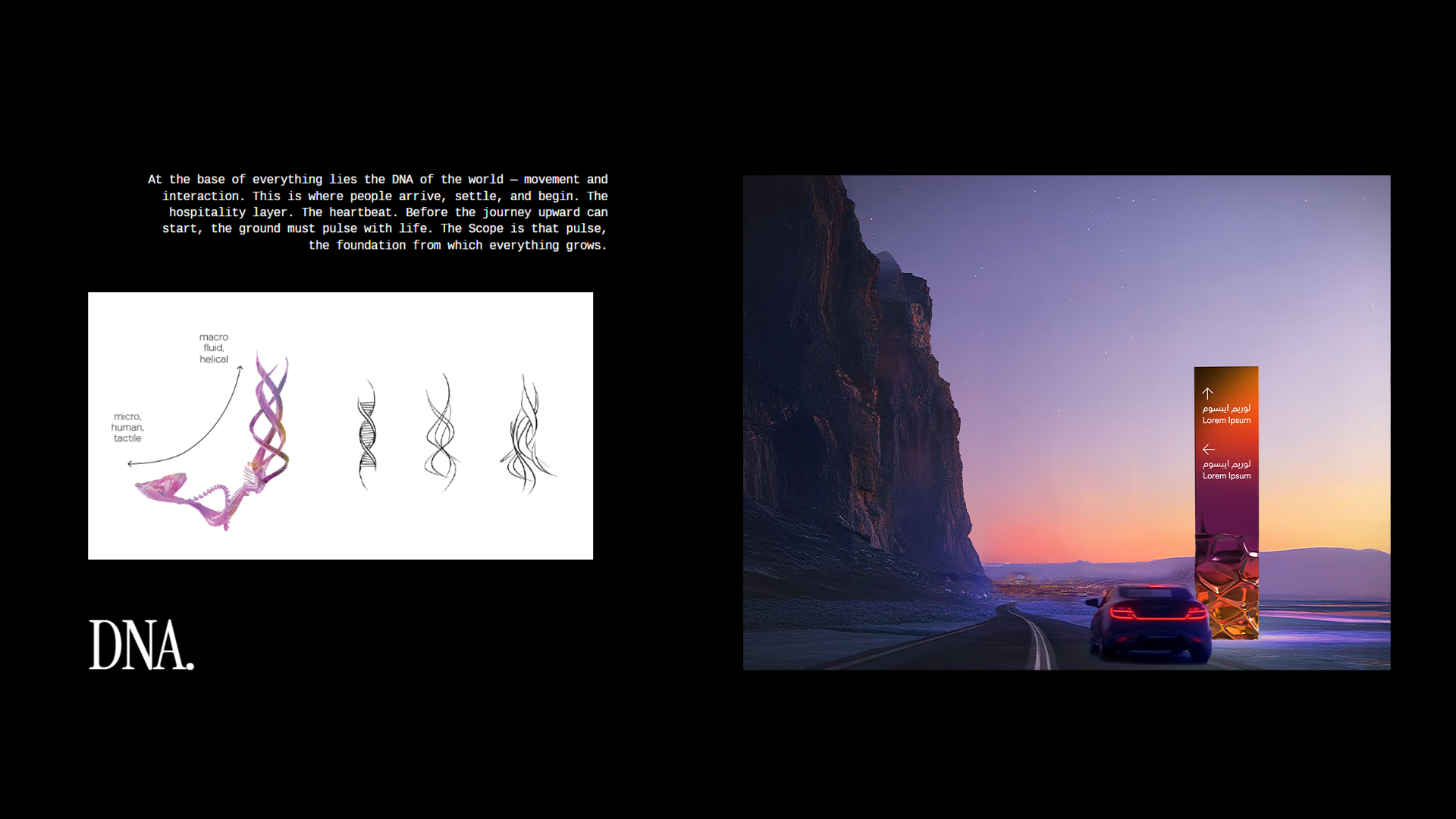
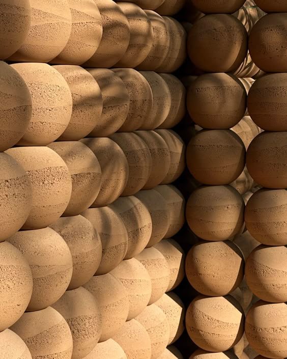
Every universe has an origin, and ours begins at the base of a mountain. At its roots lies The Scope, the DNA of this world, where movement and interaction set the heartbeat of everything above. From there, the journey ascends through The Crystal, nature in its most elemental form, a living scarp shaped by pressure and time, where structured energy and transformation are embedded in the geology itself. And at the summit, the world opens into The Cloud, a public realm suspended above everything, where the rhythm of connections and associations takes over and play reaches its highest, freest expression. From roots to sky. From arrival to elevation. From movement to belonging.

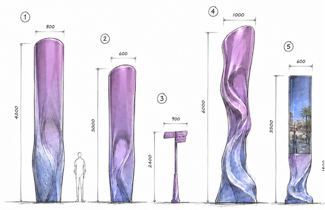
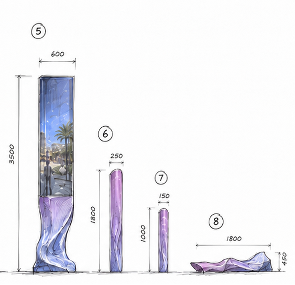
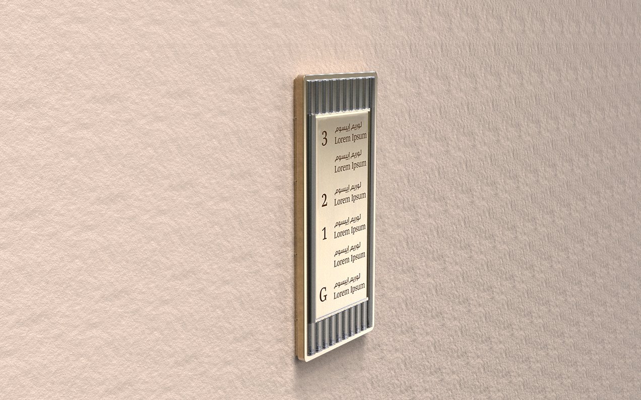
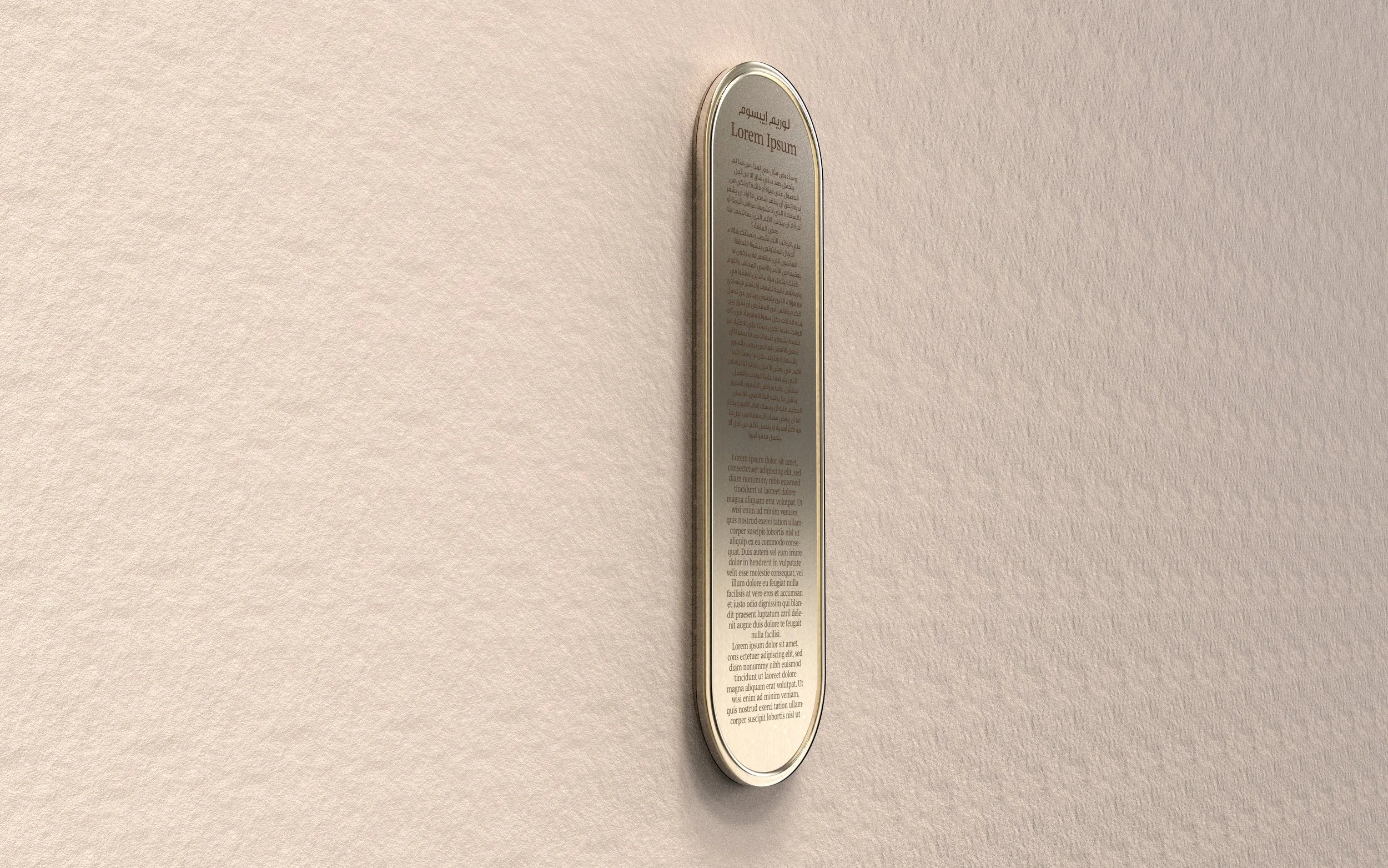
Sign
Family.


Sign
Family.
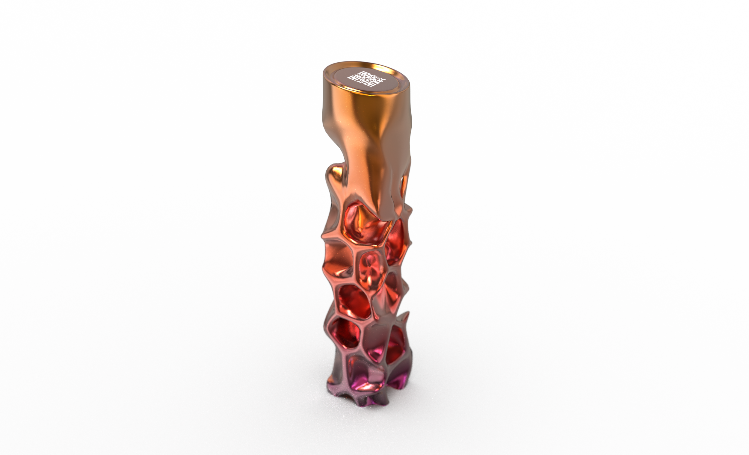
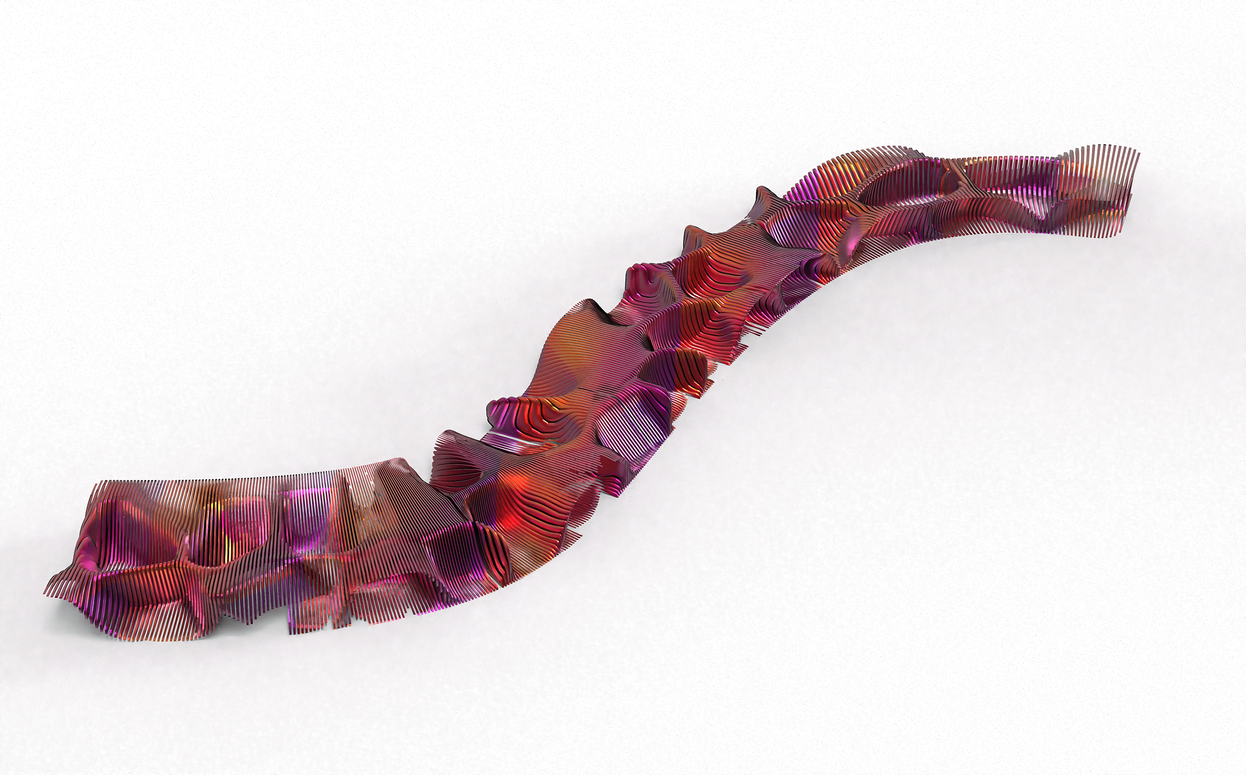
Sign
Family.
Next Project.
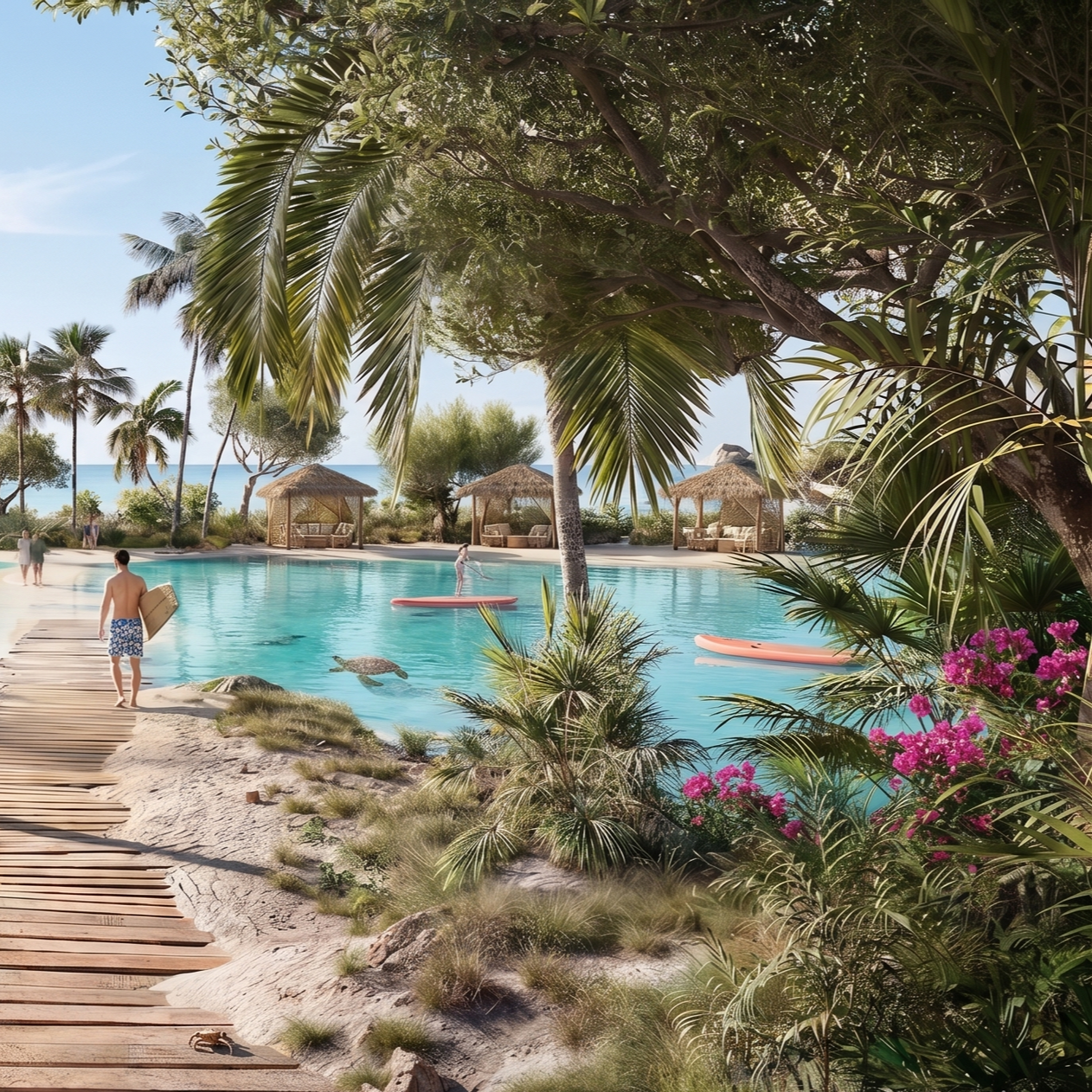
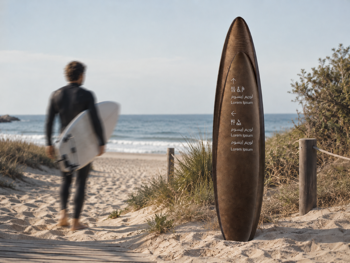
Where the ocean meets action.
A destination built for those who live at the intersection of sport and nature. The Beach Sports District brings together a marine hub, surf breaks, and a full spectrum of athletic experiences within a single, unified public realm. More than a resort, it's a living sports ecosystem where the energy of the water sets the rhythm for everything on land. Designed to move as fluidly as the sea it sits beside, every zone connects seamlessly, drawing people deeper into the experience whether they're in the water, on the sand, or simply soaking it all in.
02.
Beach Sports District.
Project Type.
-
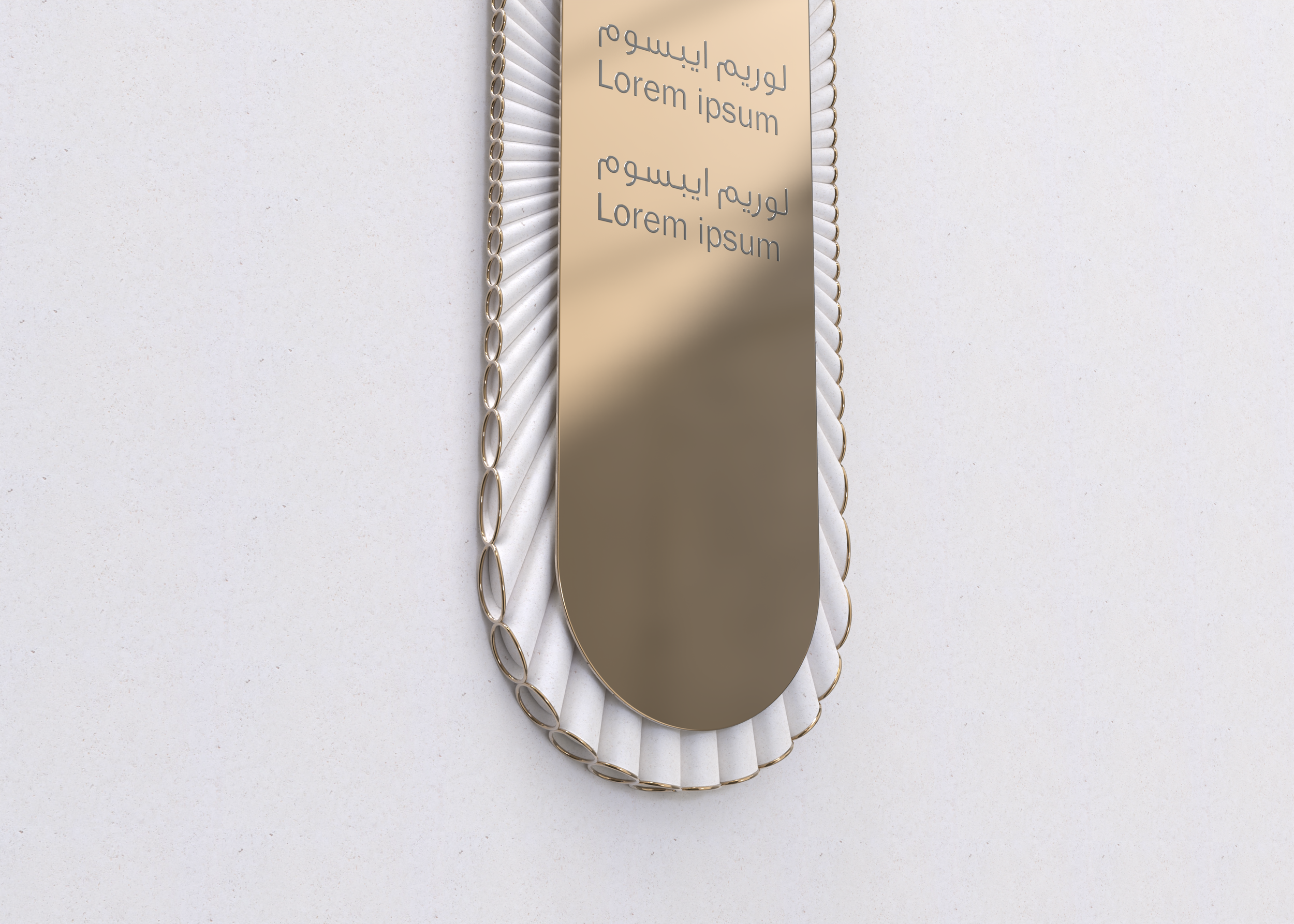
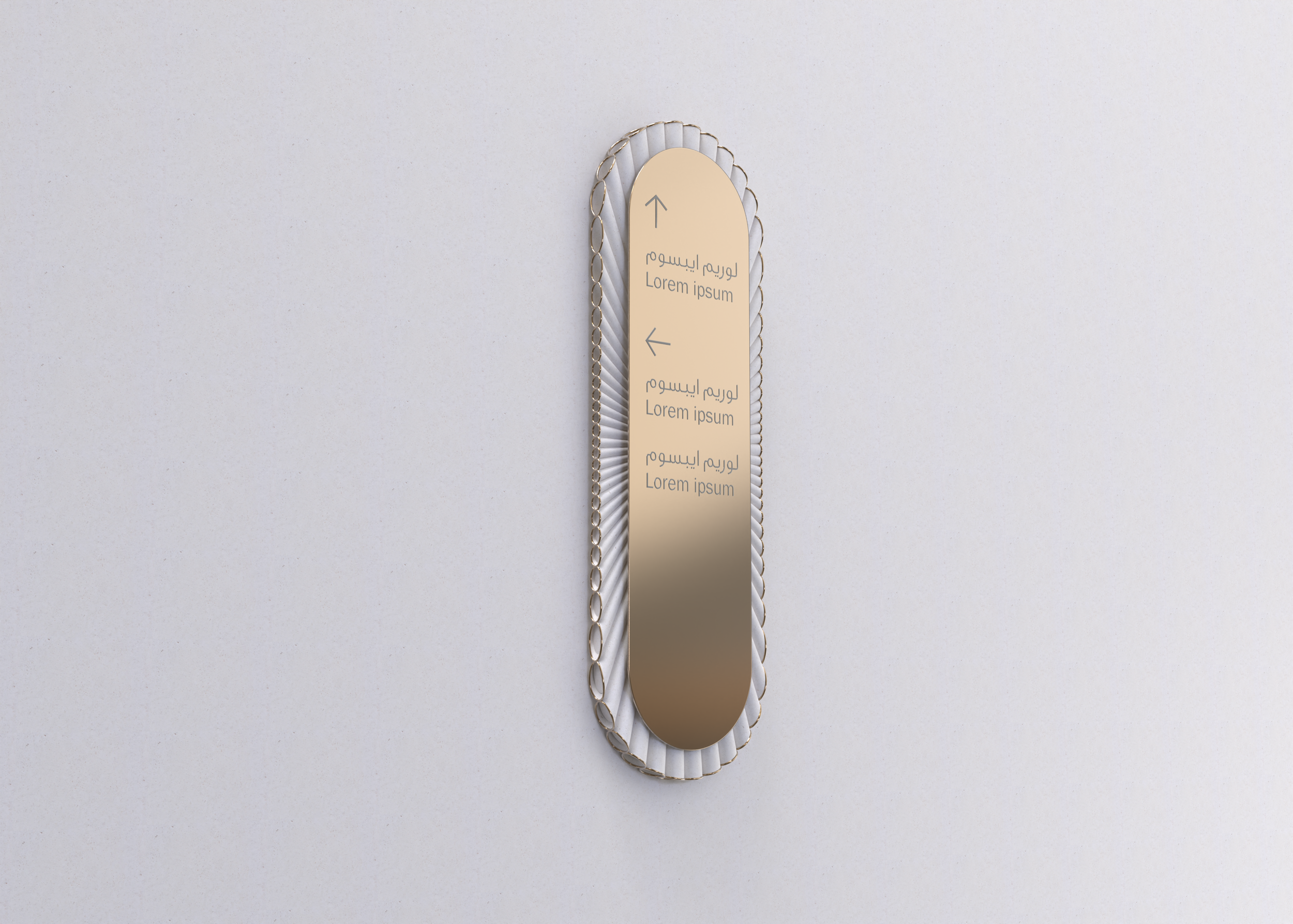
Crafting a visual system where every sign feels native to the world it lives in,from typographic choices to material language, designed to inform without interrupting the experience.
-
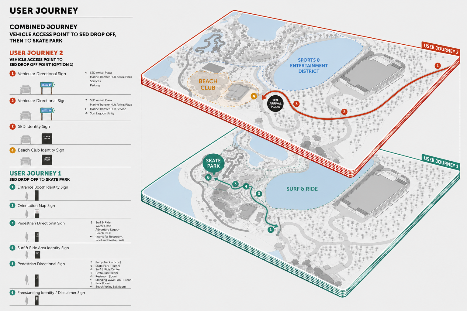
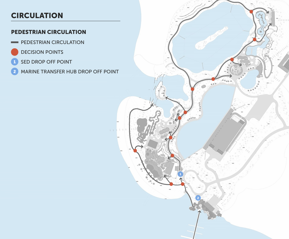
Building the logic beneath the surface and mapping how people move, where they pause, and how a destination communicates direction intuitively, without ever making the visitor think too hard.
-
Translating concepts into space and bringing the design to life through three-dimensional renders that communicate scale, atmosphere, and intent before a single physical element is built.
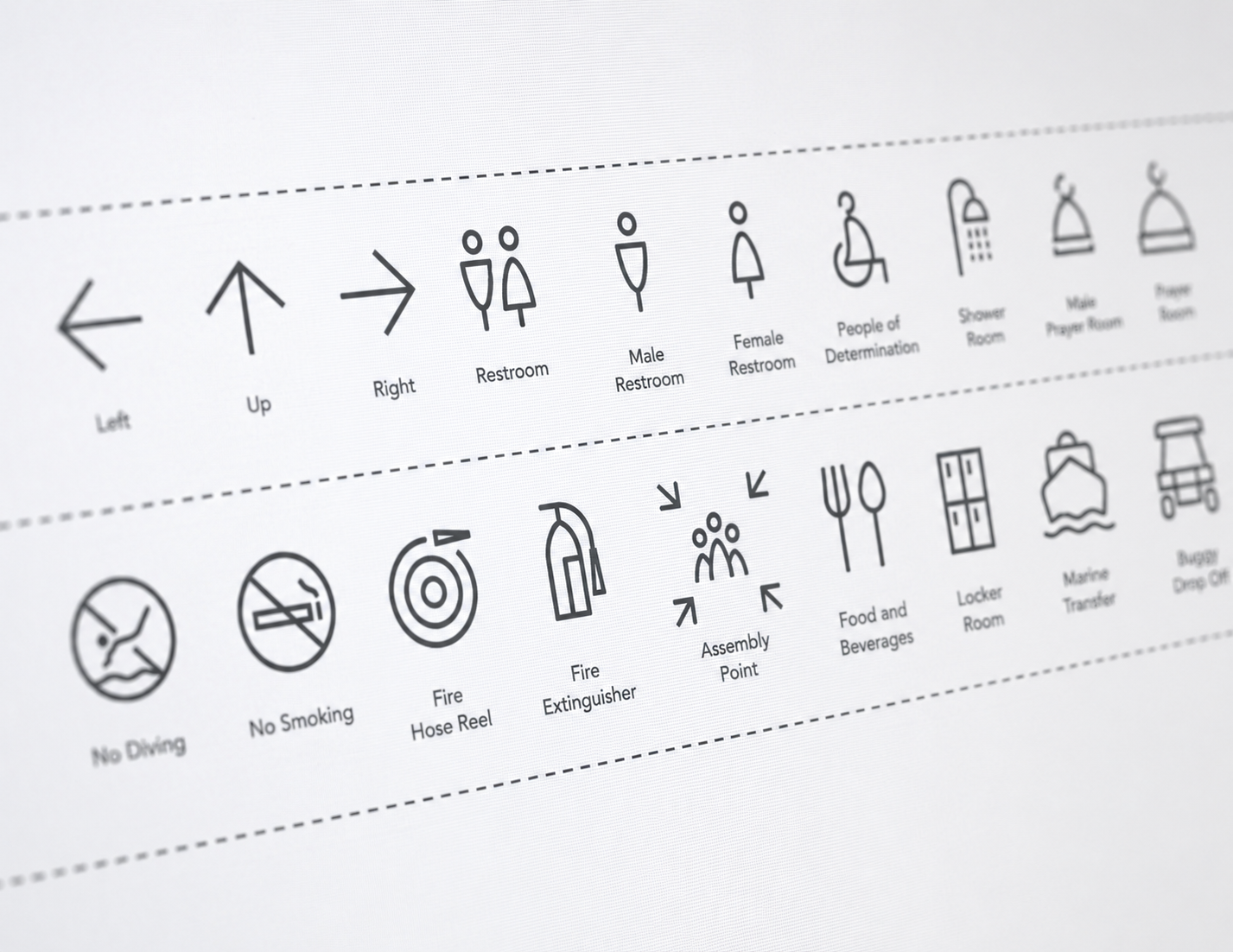
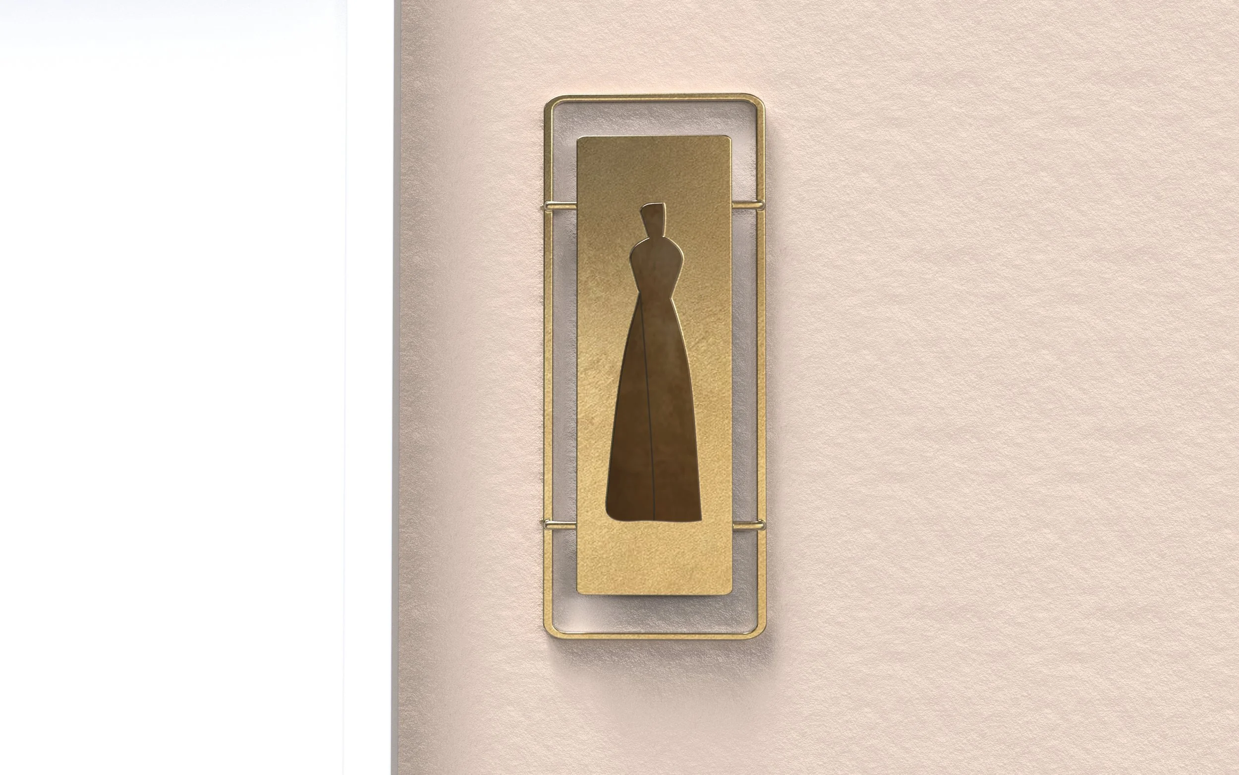
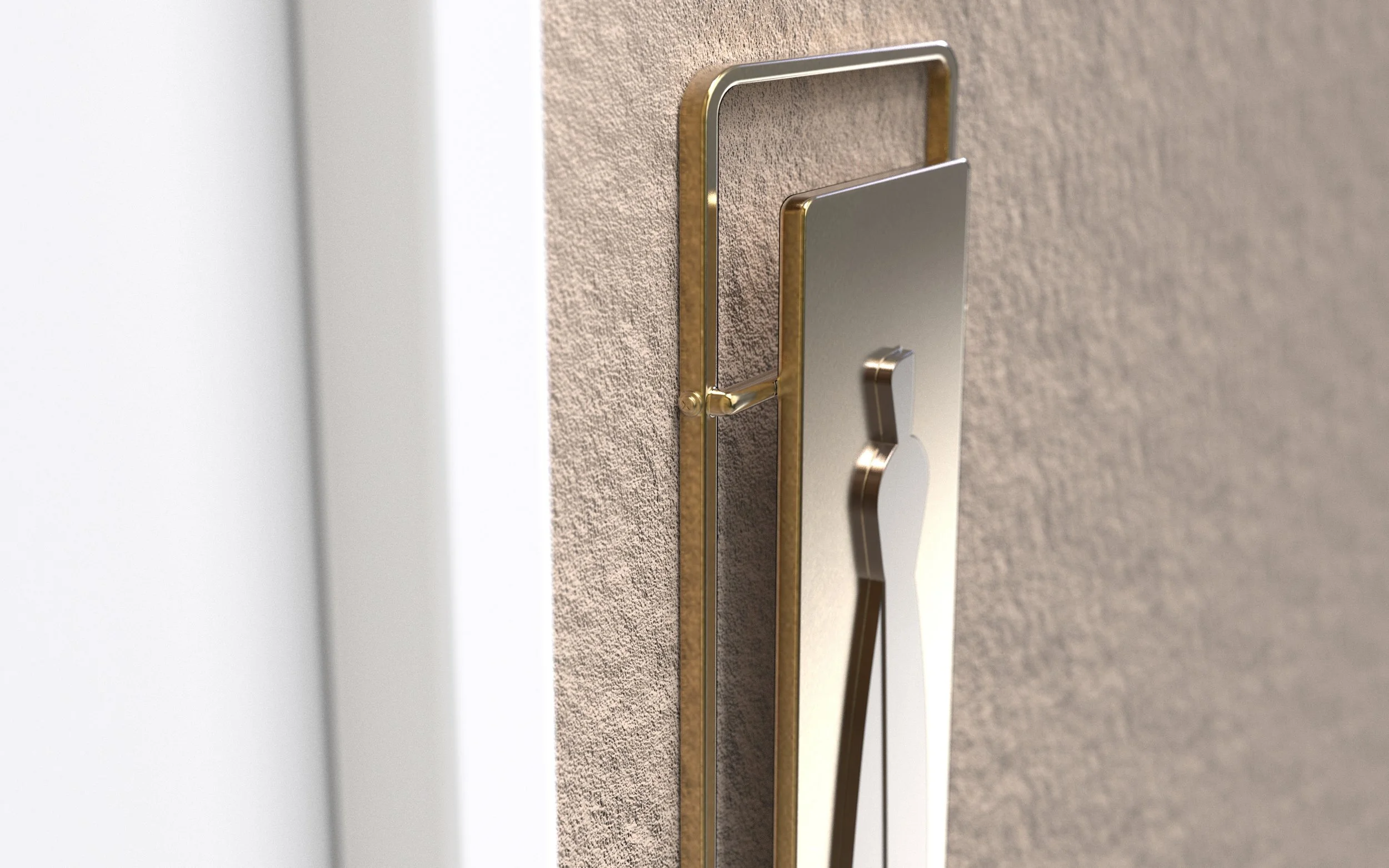
Pictograms & Graphics.
Designing a visual language that transcends words, a system of icons, symbols, patterns, and environmental graphics that communicate instantly and universally, while adding depth, character, and cohesion to every touchpoint of the destination.
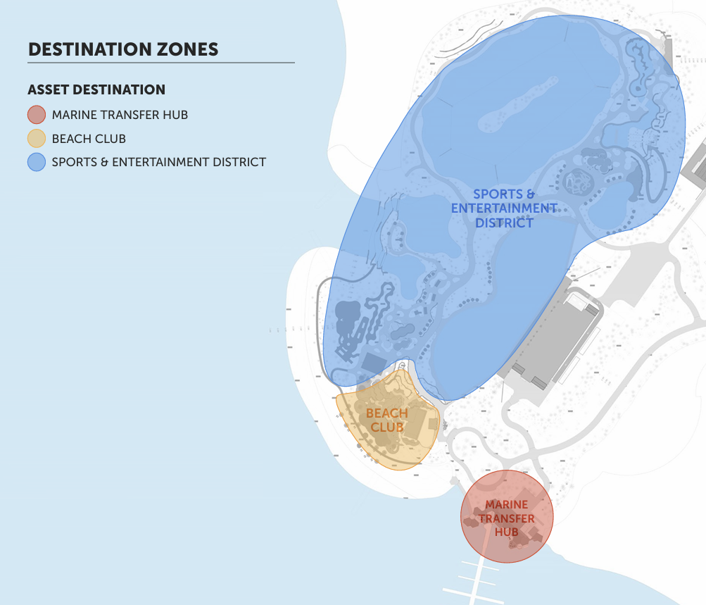
Dividing the destination into clearly defined zones that each carry their own identity and giving visitors an intuitive sense of where they are, what to expect, and how each area relates to the whole.
Mapping the experience from the moment someone arrives to the moment they leave, understanding how people move, what they encounter, and designing every touchpoint to feel considered and effortless.
Be clear, be confident and don’t overthink it. The beauty of your story is that it’s going to continue to evolve and your site can evolve with it. Your goal should be to make it feel right for right now. Later will take care of itself. It always does.
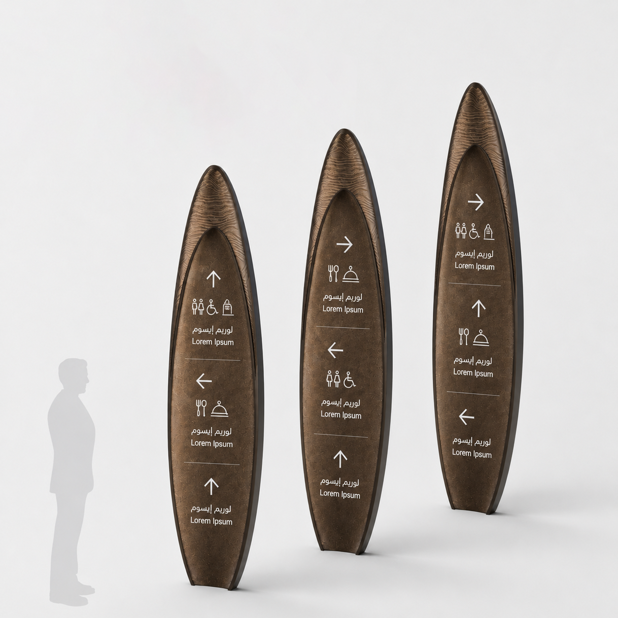
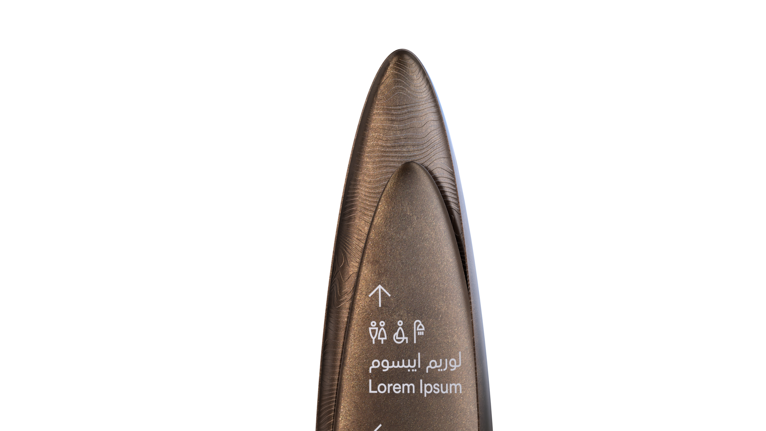
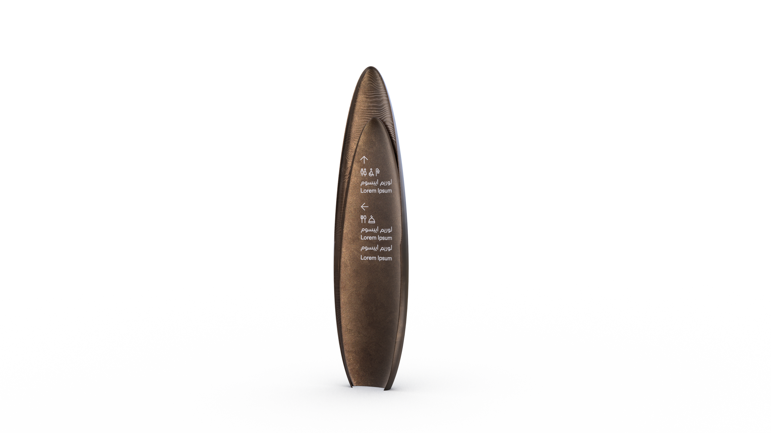
The signage Design.
The signage system was designed to feel inseparable from its environment. Drawing inspiration from the coastal landscape it inhabits, the design language embraces the simplicity and fluidity of beach culture, clean lines, natural materials, and an unhurried visual tone that mirrors the rhythm of the shore. The form of the signage takes its cue from the surfboard, a shape as iconic to this world as the waves themselves, grounding every directional element in the identity of the destination. The result is a system that doesn't just guide, it belongs.


Next Project.

03.
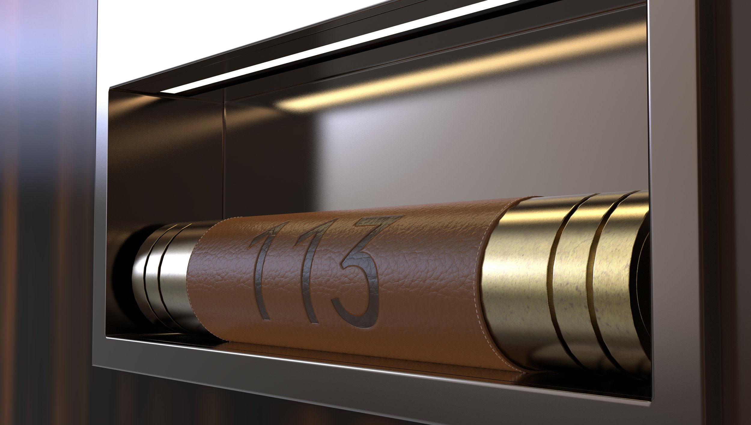
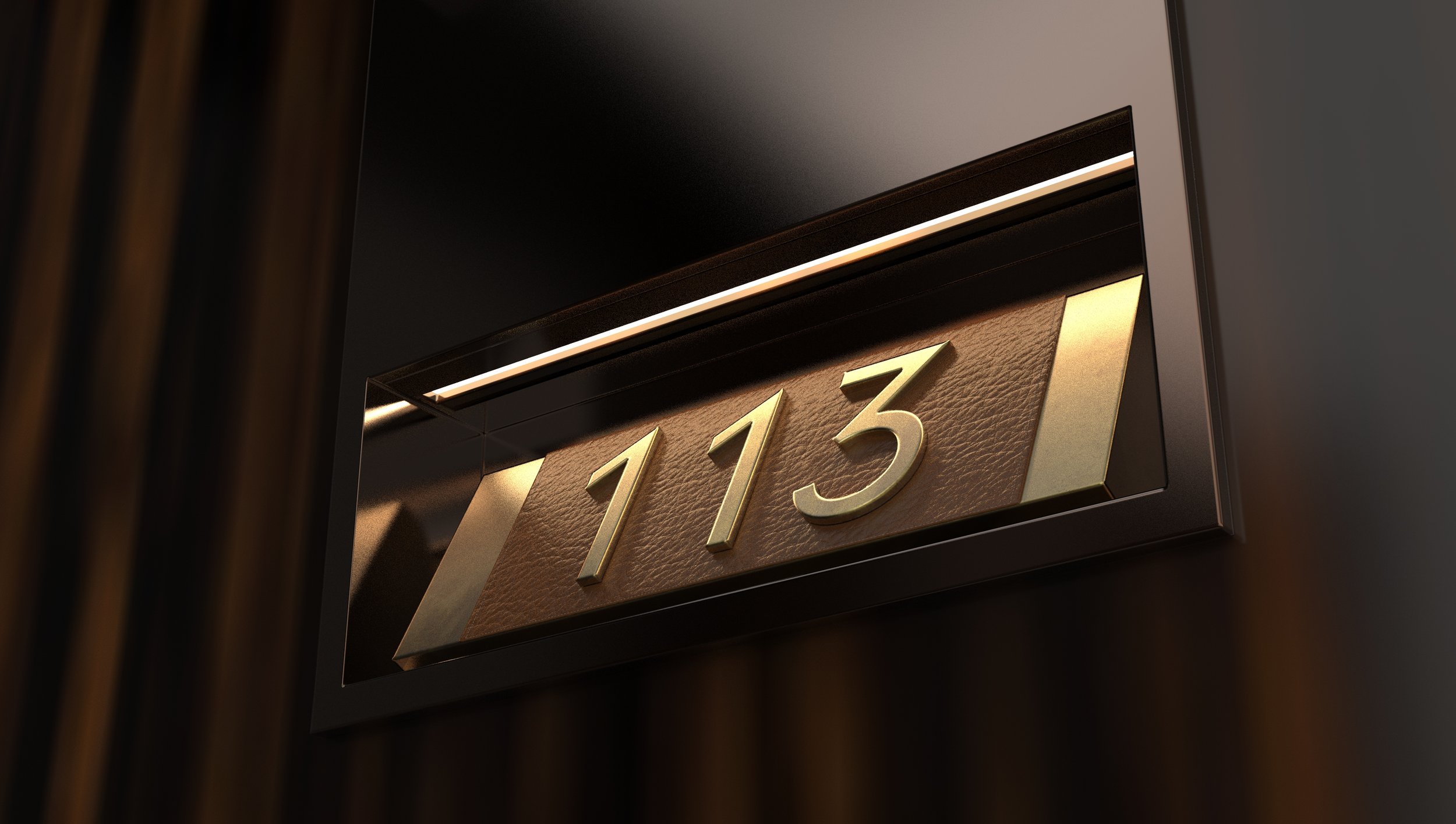
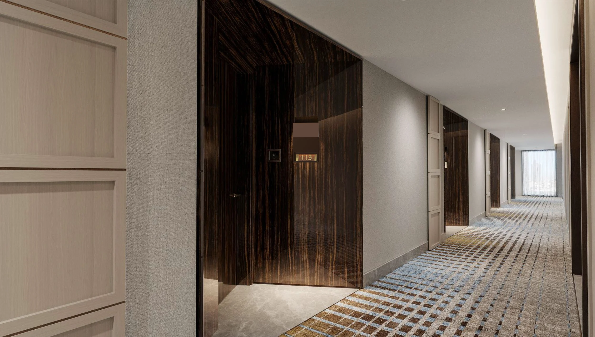
Orient Express Luxury Hotel
The brand experience carries a sense of luxury journey, sophistication and discovery. it is a symbol of refinement and craftsmanship with an essence of art deco.
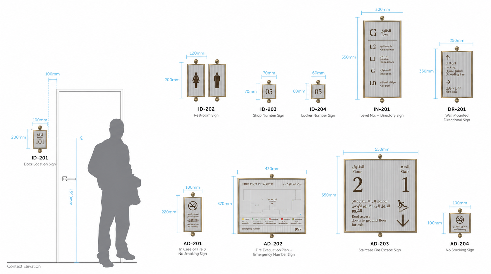
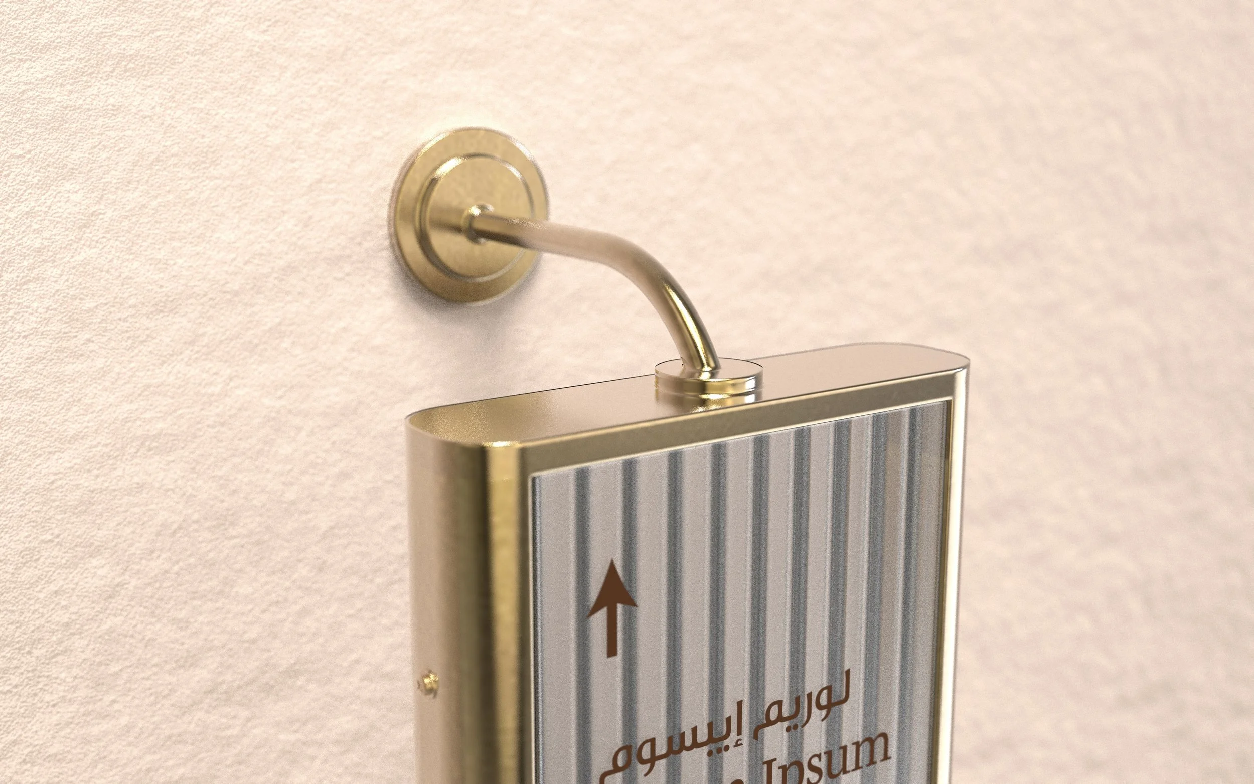
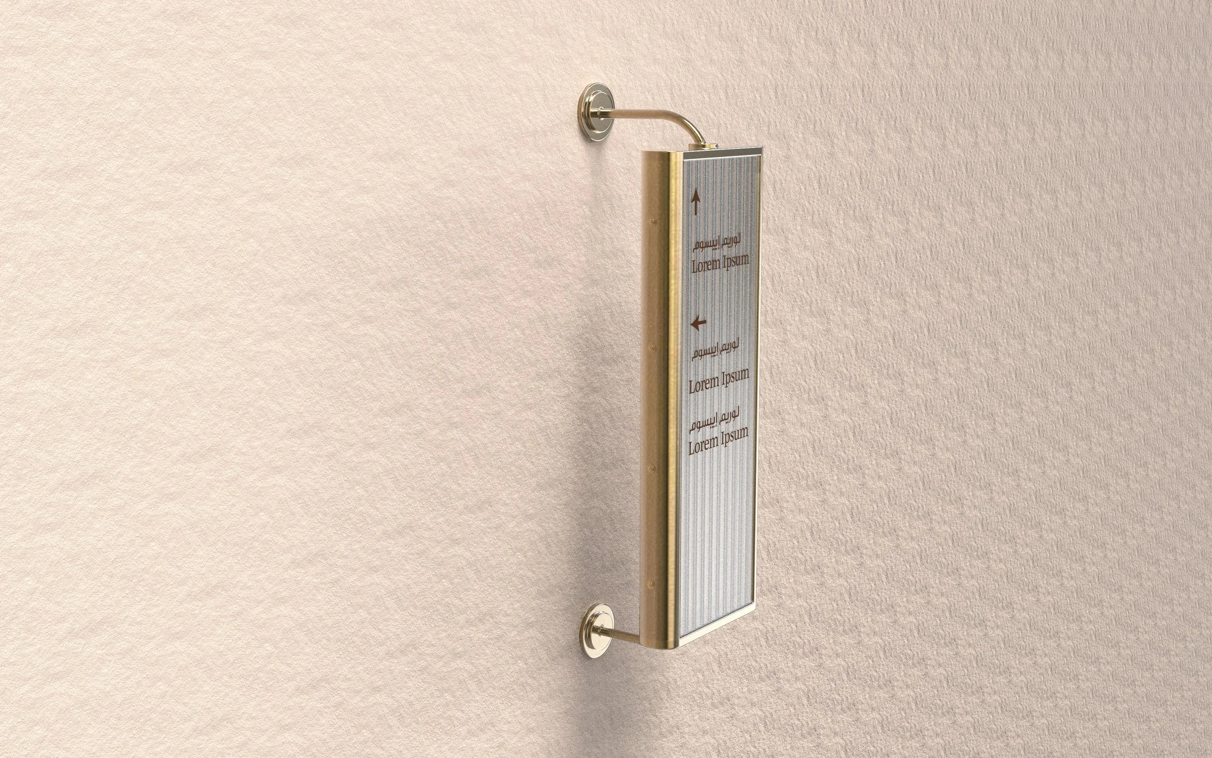
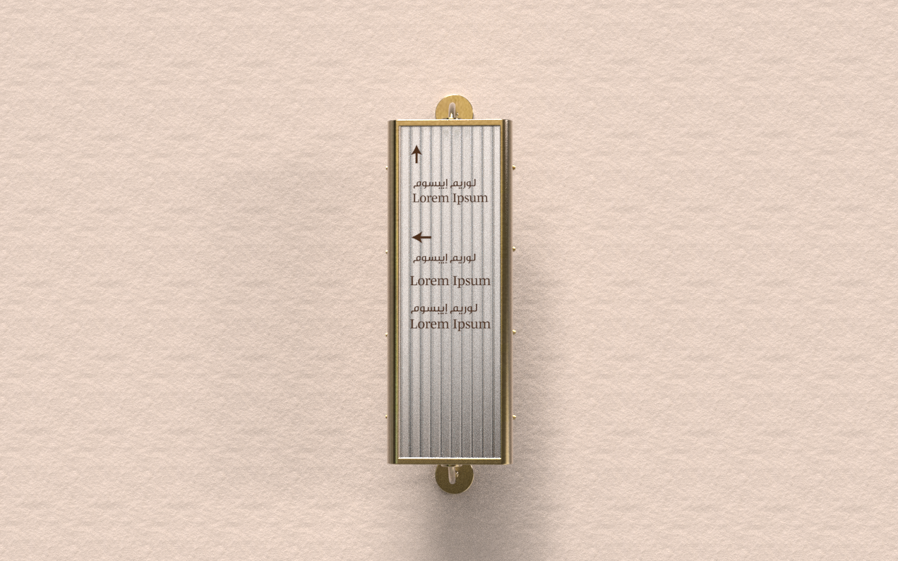
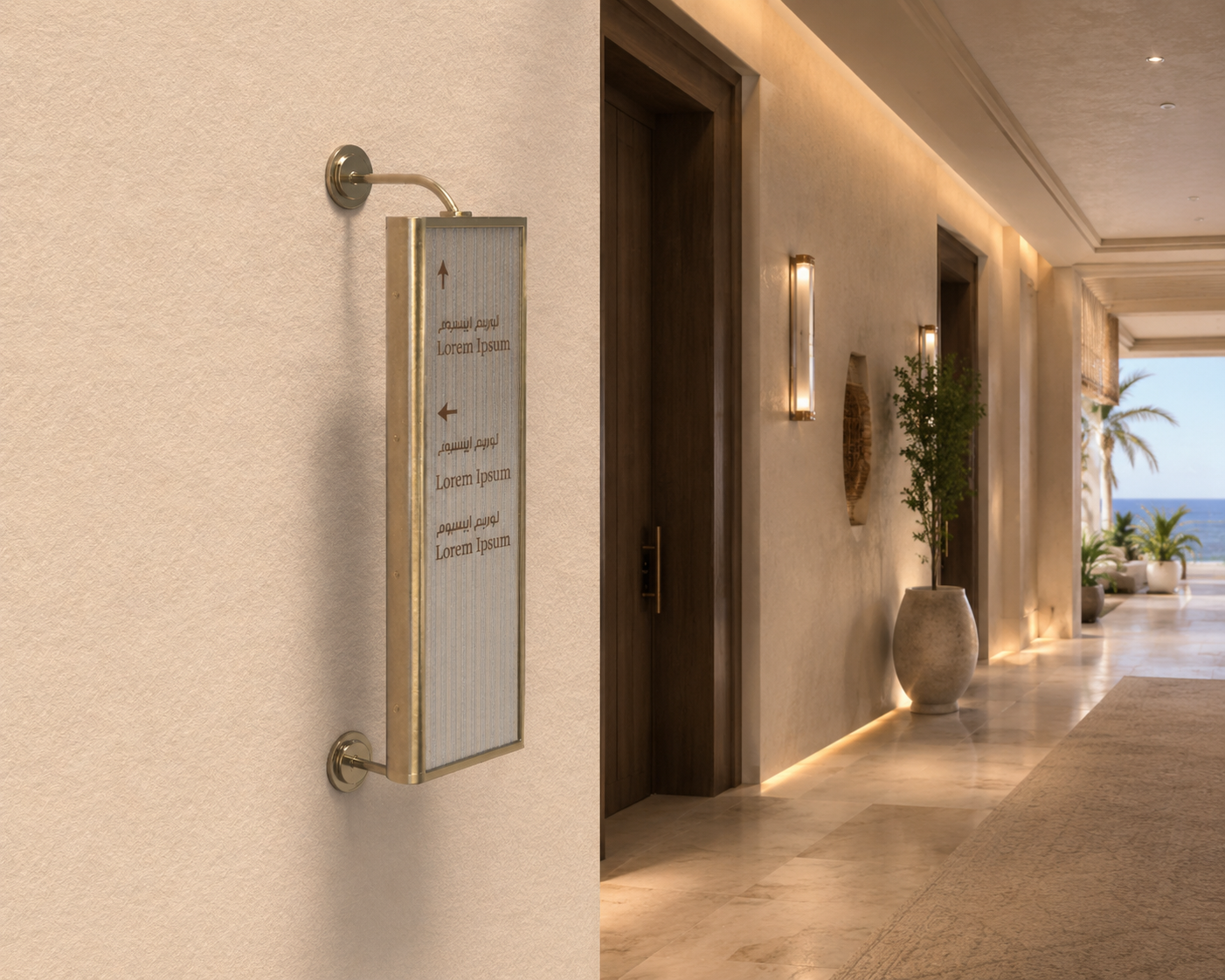
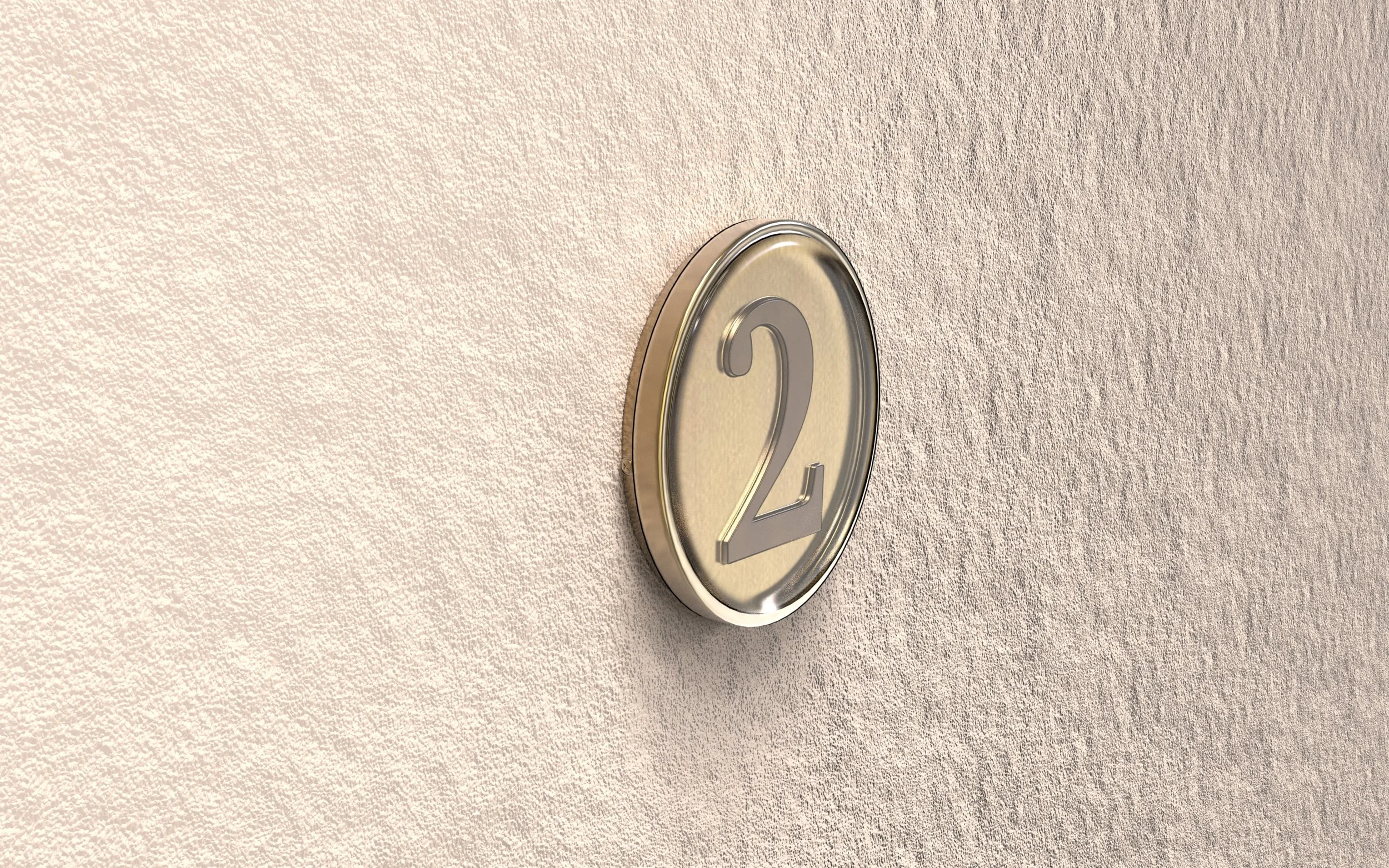
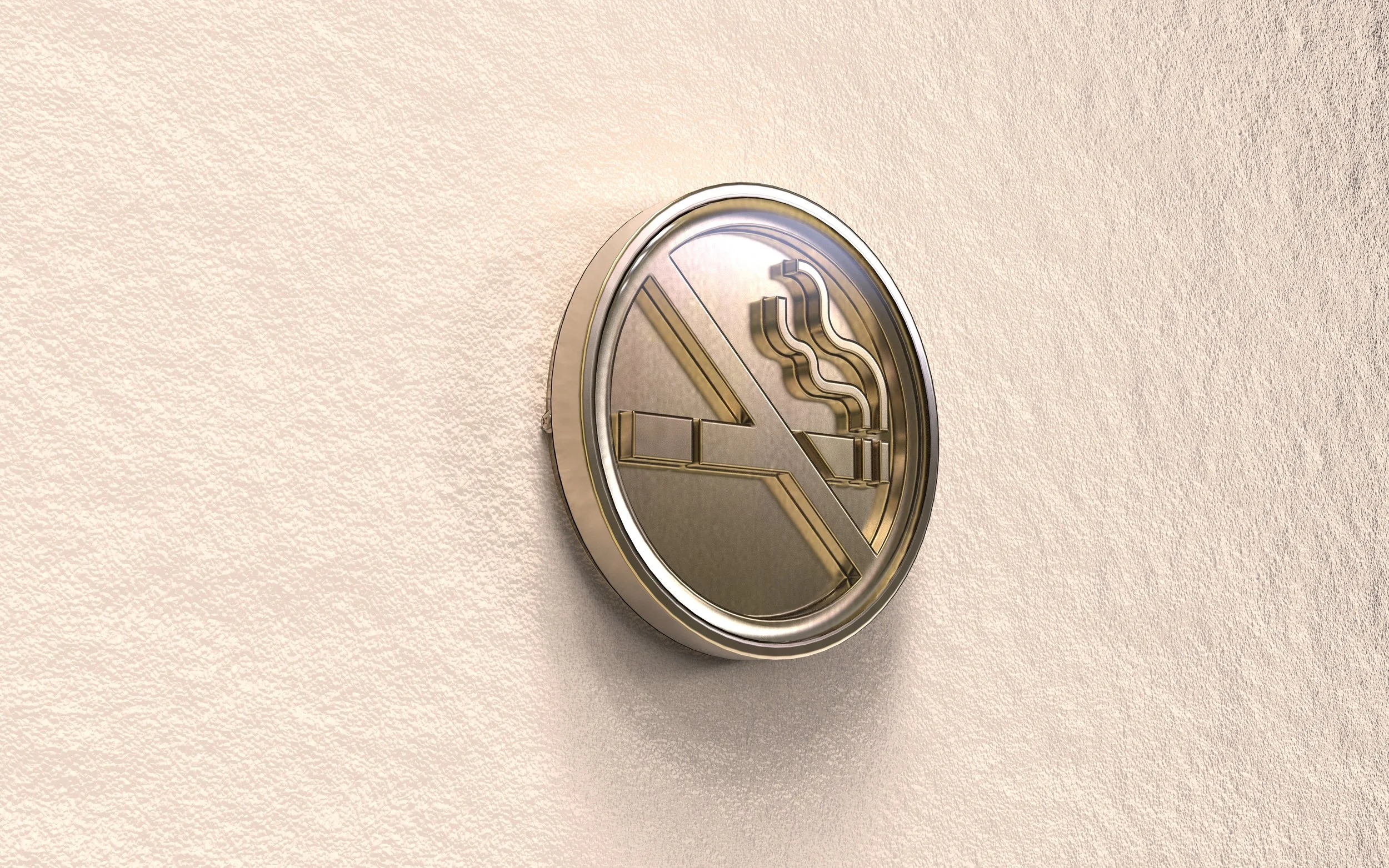
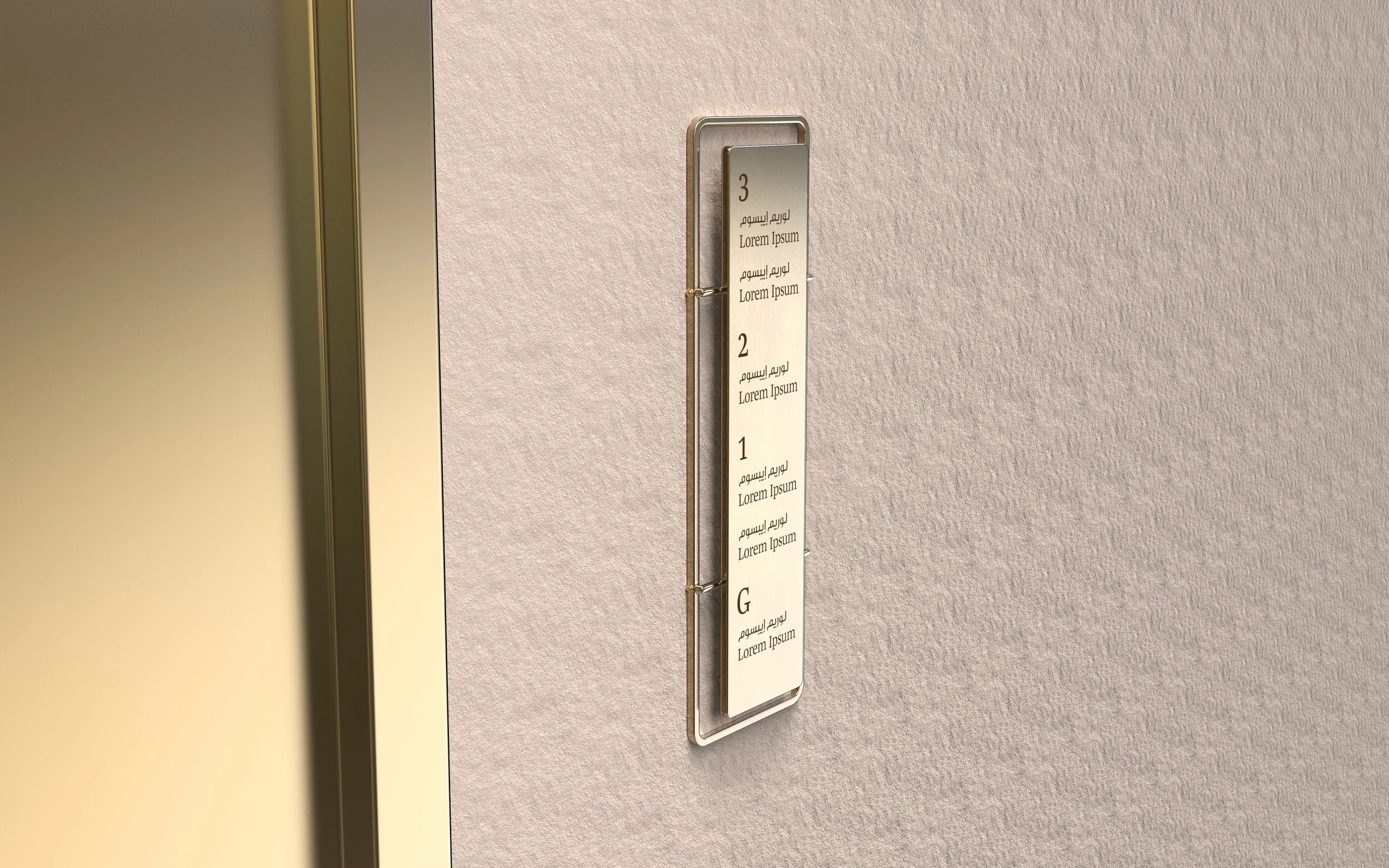
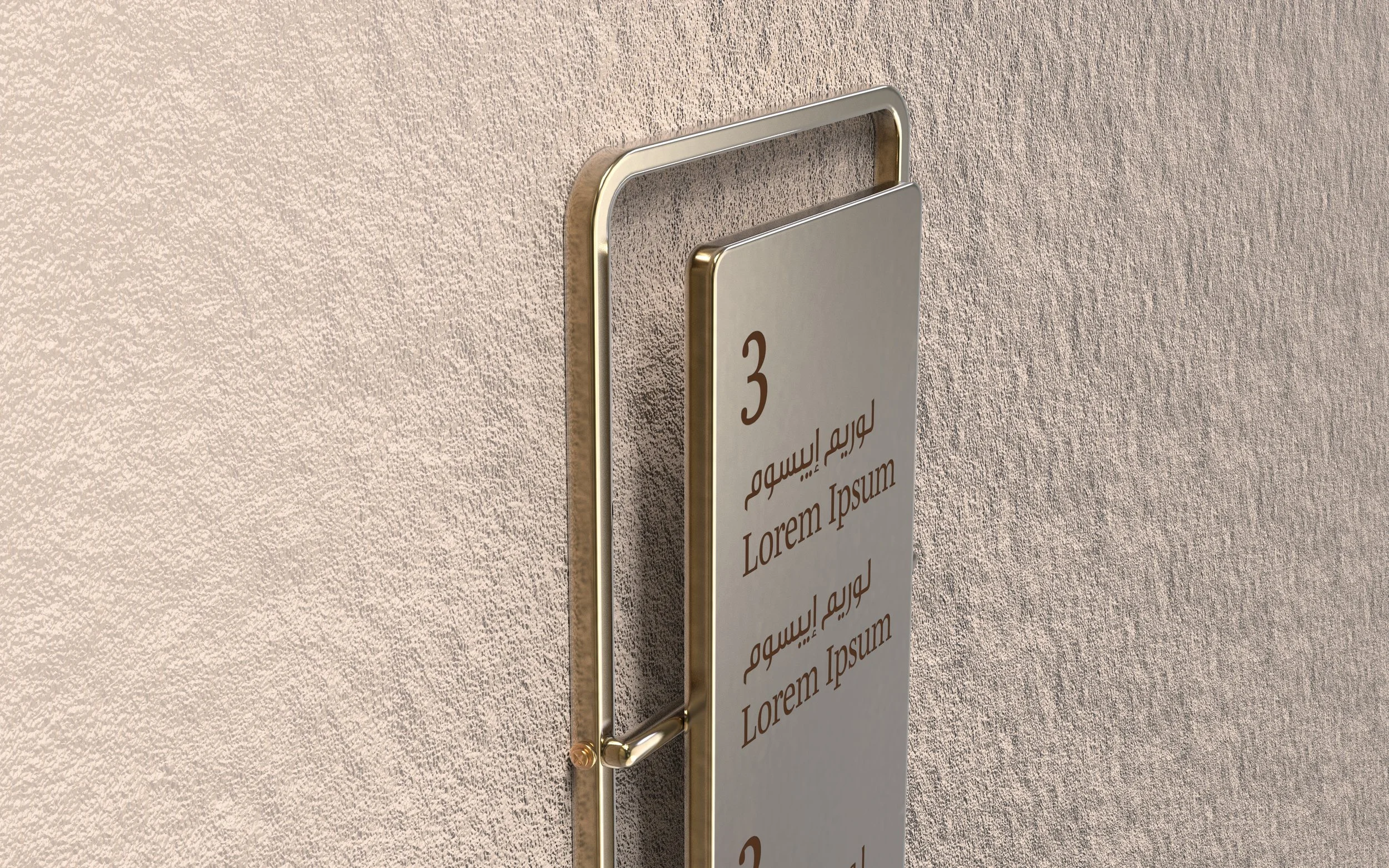
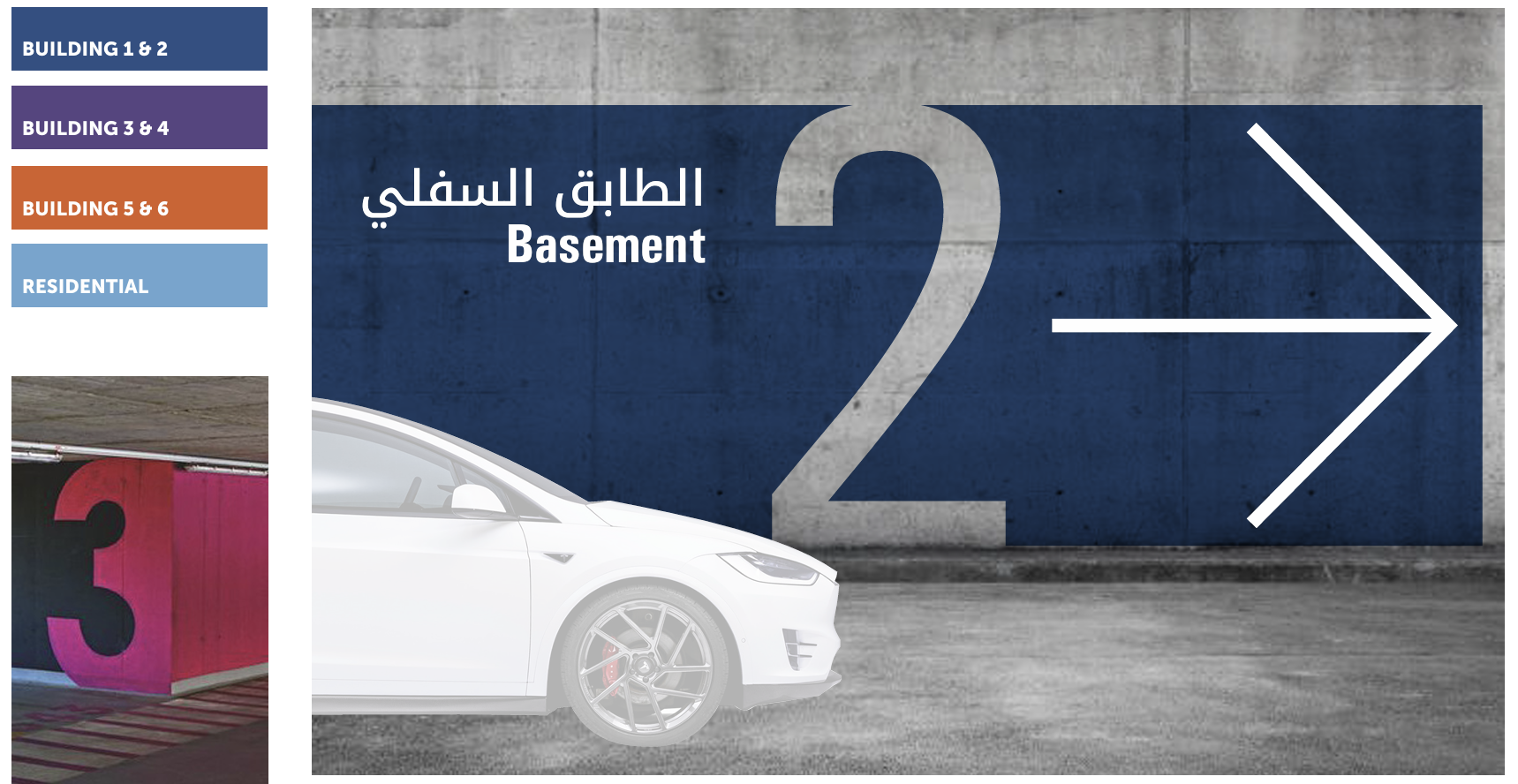
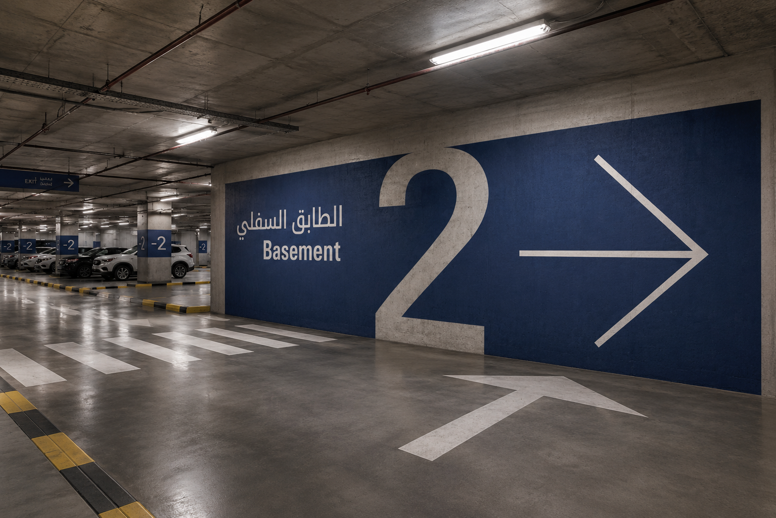
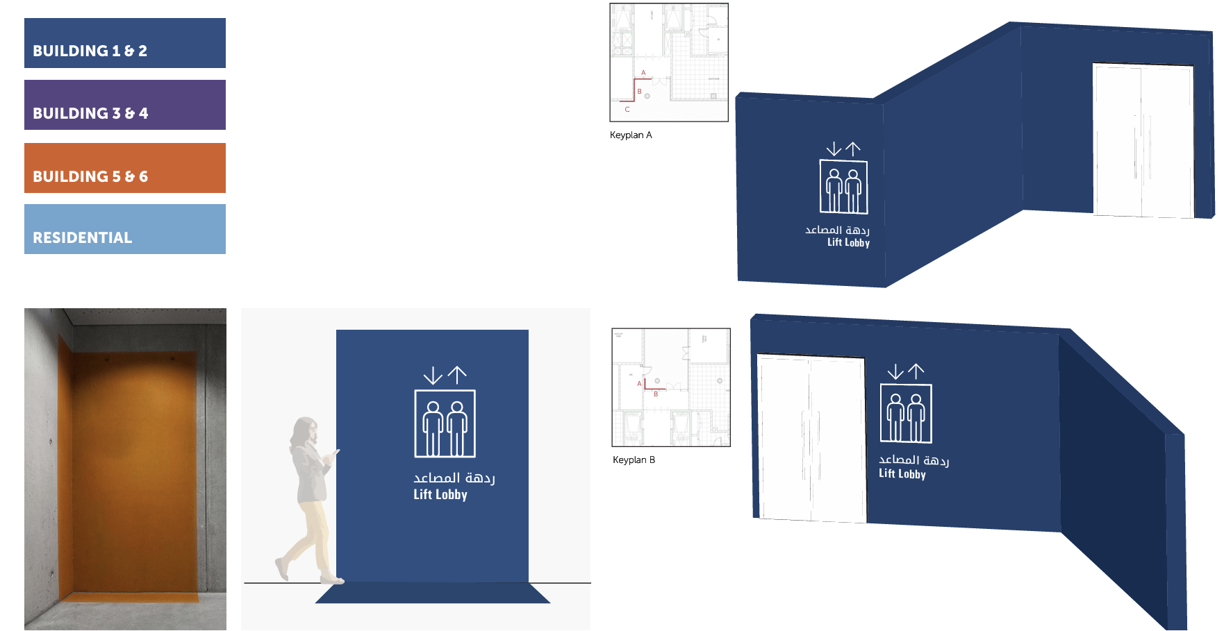
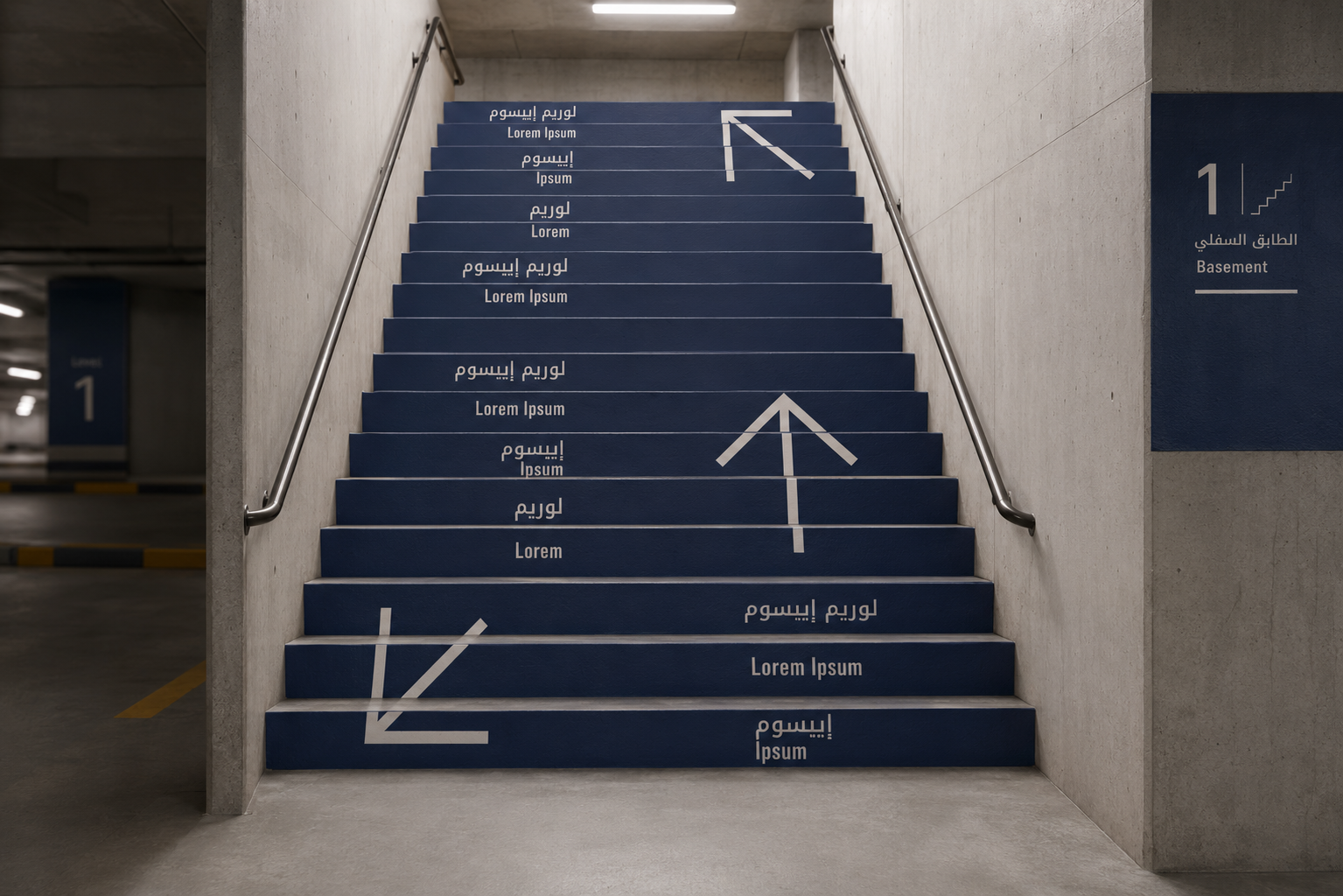
Parking Signage System.


Looking for more?
●
Signage Design
●
Creative Design
●
Renders
●
Looking for more? ● Signage Design ● Creative Design ● Renders ●